CASE STUDY
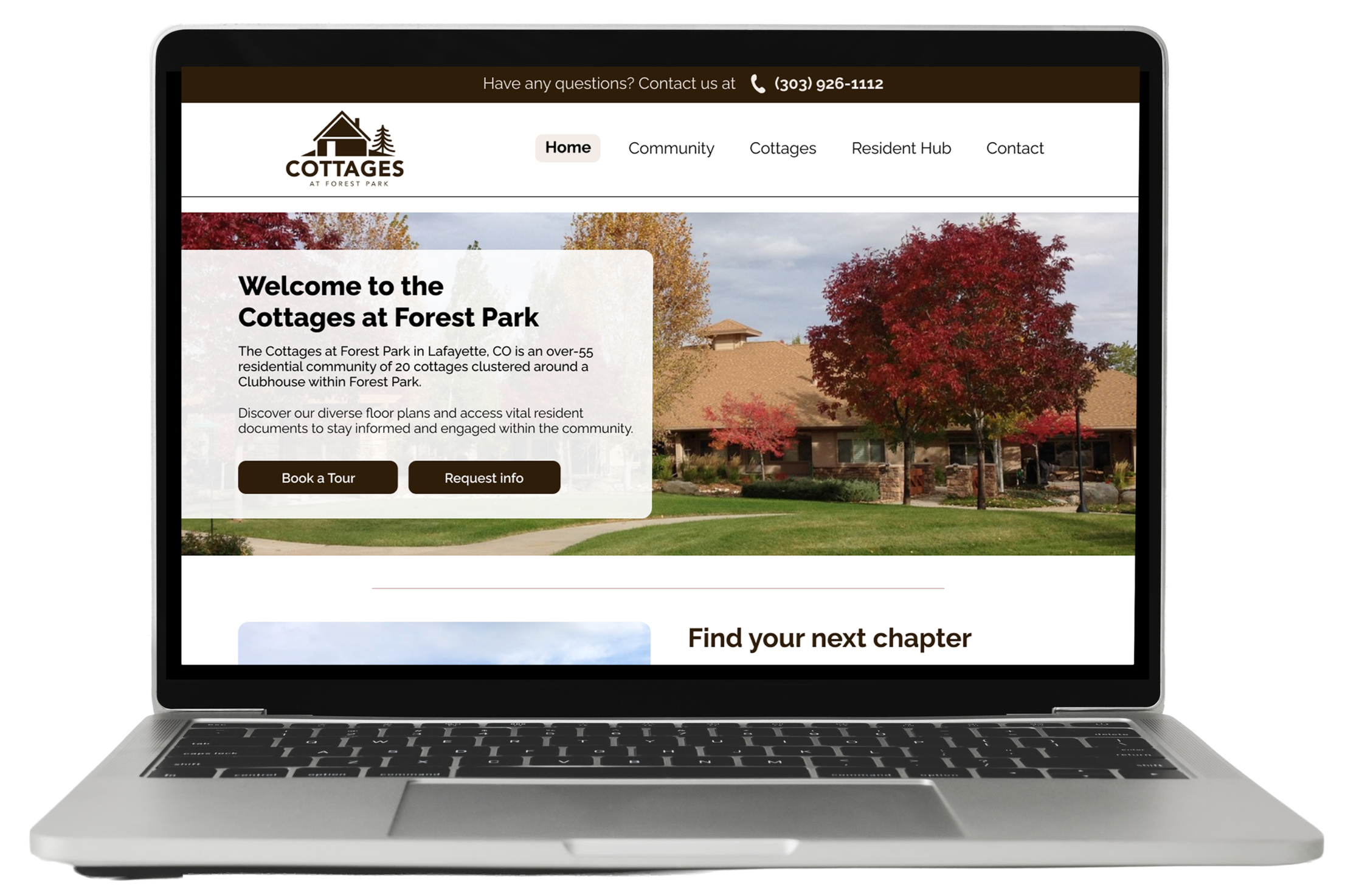
The Cottages at Forest Park Website Redesign
Transforming Real Estate Sales Site into an Accessible, Resident Friendly Community Hub
Overview
Project Type: Website Redesign (Academic UX Course), https://www.cottagesatforestpark.org/index.html
My Role: UX/UI Researcher & Designer (Collaborated in a 6-person team)
Timeline: 6 Months
Target Audience: Active Senior Residents (55+), Caretaking Adult Children, and Real Estate Professionals
Methodologies: Heuristic Evaluation, Accessibility Audit, Quantitative Surveys (n=40), Moderated Usability Testing (n=25), User Personas, Journey Mapping, Information Architecture Redesign, High-Fidelity Prototyping
The Cottages at Forest Park is an established 55+ active adult community in Lafayette, Colorado, consisting of 20 privately owned homes.
BACKGROUND
The community’s existing website was built years ago to market and sell the units. Today, every cottage in the community is privately owned and occupied.
Despite this shift, the website remained frozen in its commercial sales phase. The interface was actively trying to sell homes that were not on the market, which ignored its regular and primary users: current residents looking for governance documents, local events, and neighborhood connections, and prospective buyers looking for realistic availability data.
OBJECTIVE
The goal was to completely redesign the digital experience using a desktop- and mobile-friendly, accessibility-focused approach. We set out to transition the platform from a marketplace structure into an intuitive and useful community resource that respects the physical and cognitive needs of a senior demographic.
The Challenge
Heuristic Evaluation and Accessibility Audit
Before testing with real users, our team conducted a comprehensive audit of the live production site using Nielsen’s 10 Usability Heuristics and the WCAG POUR Framework (Perceivable, Operable, Understandable, Robust).
KEY FINDINGS
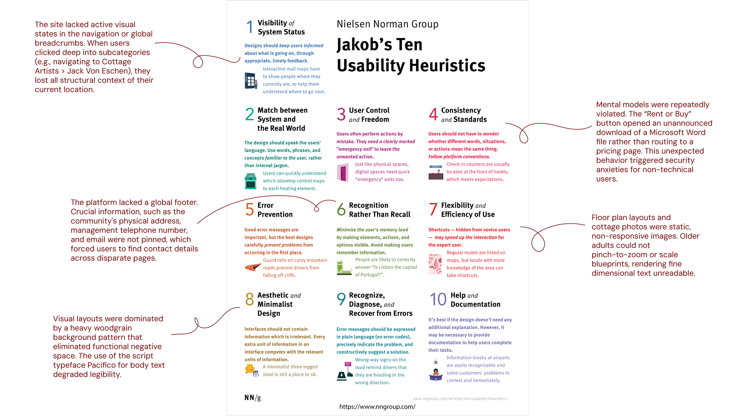
Furthermore,
Key communication sections on the contact page exhibited a contrast ratio of 3.67:1, falling well below the WCAG AA minimum standard of 4.5:1 for normal text, which is a severe accessibility failure.
Pain Points Discovered:
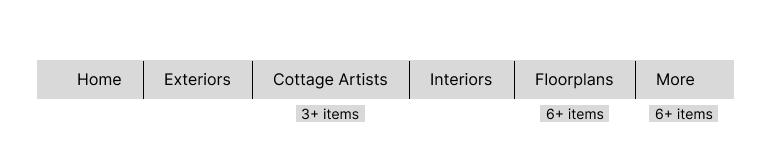
17+ ungrouped, overlapping menu items
“Rent or Buy” button triggers a raw Word document download
Busy woodgrain background combined with thin script fonts (Pacifico)
Failing contrast ratio of 3.67:1 on important contact pages
User Surveys (n=40)
To back up our expert opinions with empirical data, we launched a quantitative and qualitative screening survey targeting a panel of 40 participants representing our target demographics, including current residents of the community.
INSIGHTS
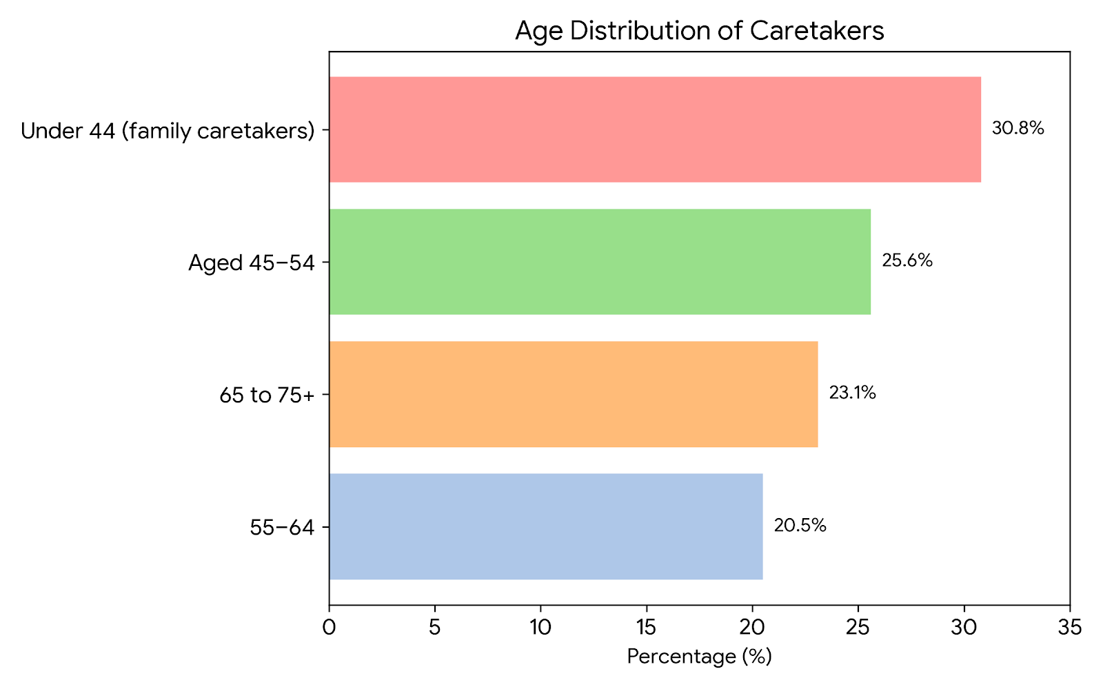
Age Distribution: 30.8% were under 44 (family caretakers), 25.6% were aged 45–54, 20.5% were 55–64, and 23.1% were 65 to 75+.
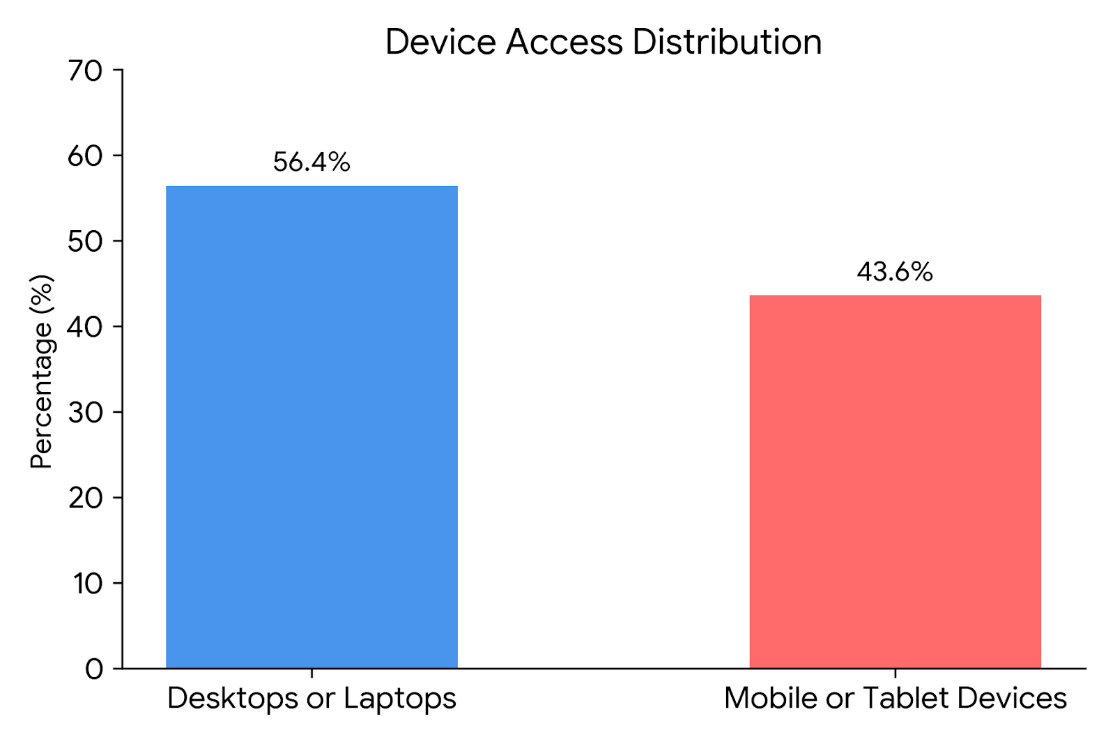
Device Access: 56.4% visited using desktops or laptops, while 43.6% accessed the site via mobile or tablet devices.
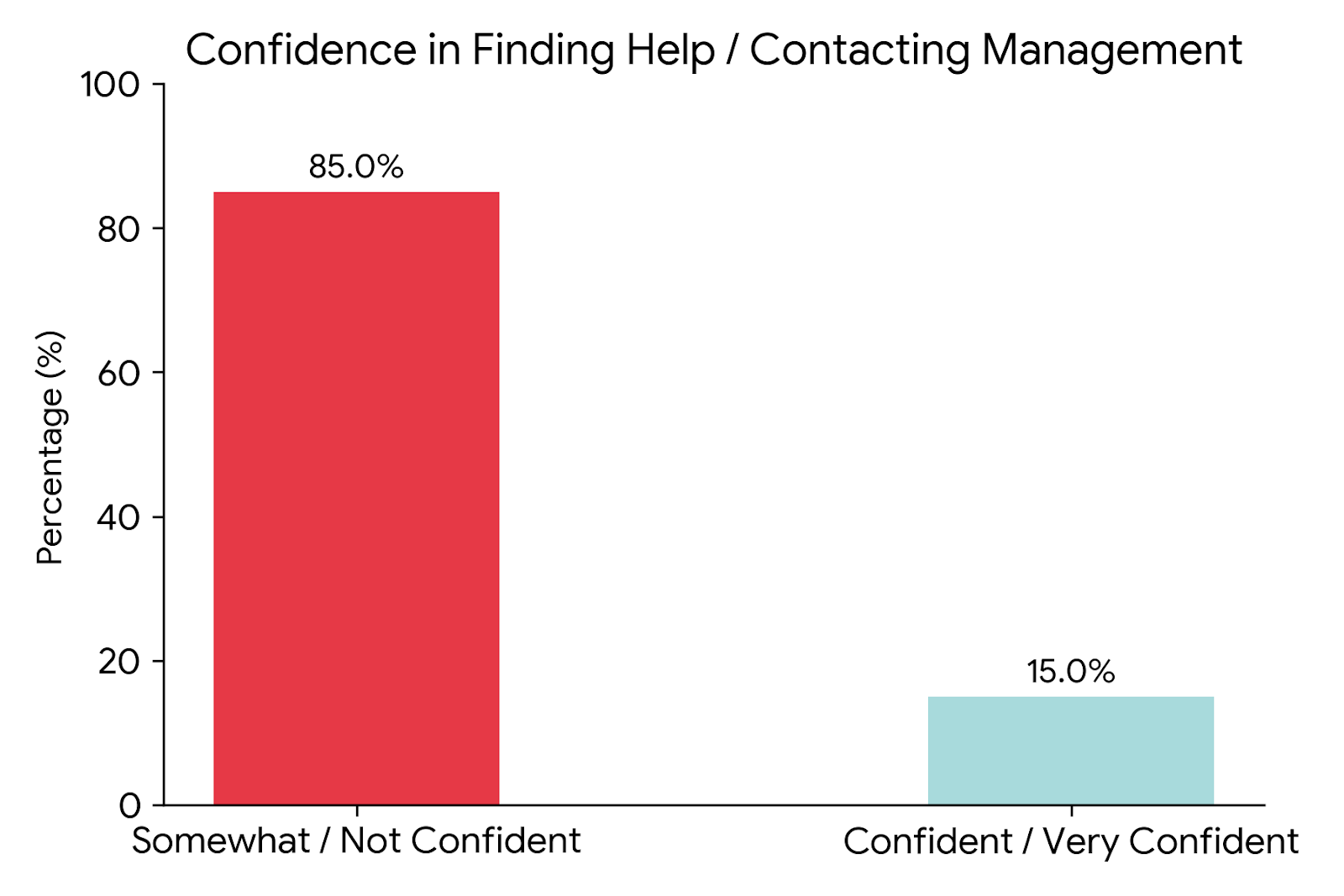
The Trust Gap: An overwhelming 85% of respondents felt only "somewhat confident" or "not confident at all" that they could successfully find help or contact management on the current site.
USER EXPECTATIONS VS. REALITY
The top three pages users visited were the Home Page (89.7%), Galleries (79.5%), and Floor Plans (56.4%). The current site failed to provide the very information they came for:
USER EXPECTATIONS
Clear instructions and pricing for unit options
Community amenities and social activities
Readable text and clear images
REALITY
Pricing information hidden in downloadable Word document.
Amenities information buried inside the downloadable PDFs.
Unreadable cursive fonts and un-zoomable graphics.
Personas
We synthesized our survey data into four distinct, data-driven personas to guide our design decisions:
Miguel (Age 56) | The Retirement Shopper

Linda (Age 72) | The Engaged Resident

Needs to quickly find the clubhouse reservation rules to organize a local social club event and to feel a part of community.
Sam (Age 45) | The Caretaking Child


Wants to downsize to an active senior community. He needs crisp & high-contrast floor plans and room dimensions.
Sourcing accessible housing for his aging parents. He needs easily scannable HOA policies and fast contact options.
Susan (Age 41) | The Real Estate Broker
Sourcing important documentation and official points of contact on behalf of senior clients.
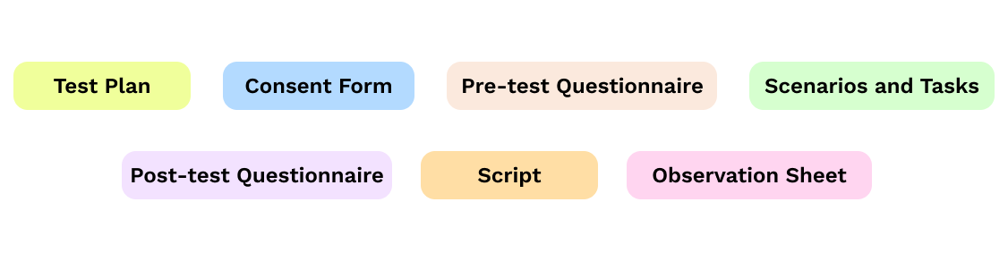
Usability Testing Materials
Usability Testing (n=25)
To test the site's core functionality, we conducted moderated usability testing with 25 participants across different devices (desktop, mobile, and tablet) using remote screen-sharing and think-aloud protocols.
TASKS WE TESTED
Scenario 1
Find the community events calendar, review local social activities, and locate the operational hours of the resident artisan gallery.
Scenario 2
Locate a specific two-bedroom cottage option, analyze its structural room dimensions, and determine its current availability.
Scenario 3
Find the rules governing resident clubhouse use, check availability, and submit a digital booking request.
METHODOLOGY
PARTICIPANTS’ RECRUITMENT
Current Residents
Prospective Residents 55+
Adult Children of Aging Parents
Real Estate Professionals
EQUIPMENT USED
Smart device with internet connection
Video recorder or conferencing software, i.e., Zoom or Google Meet
Stopwatch / Timer
Consent Form
Observation Sheet
Pre and Post Test Questionnaire
DATA ANALYSIS APPROACH
Quantitative
Qualitative
Comparitive
Top Usability Friction Points Discovered
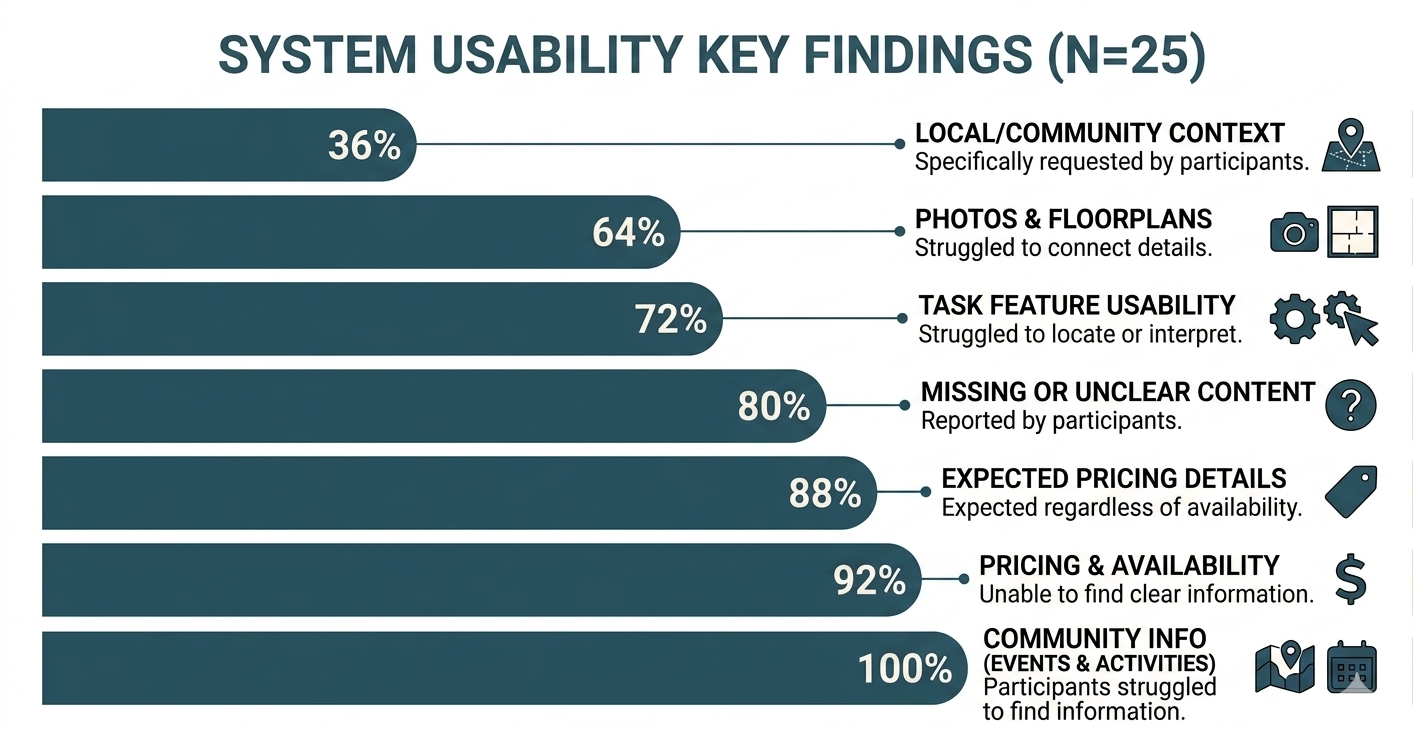
Infographic created using Google Gemini.
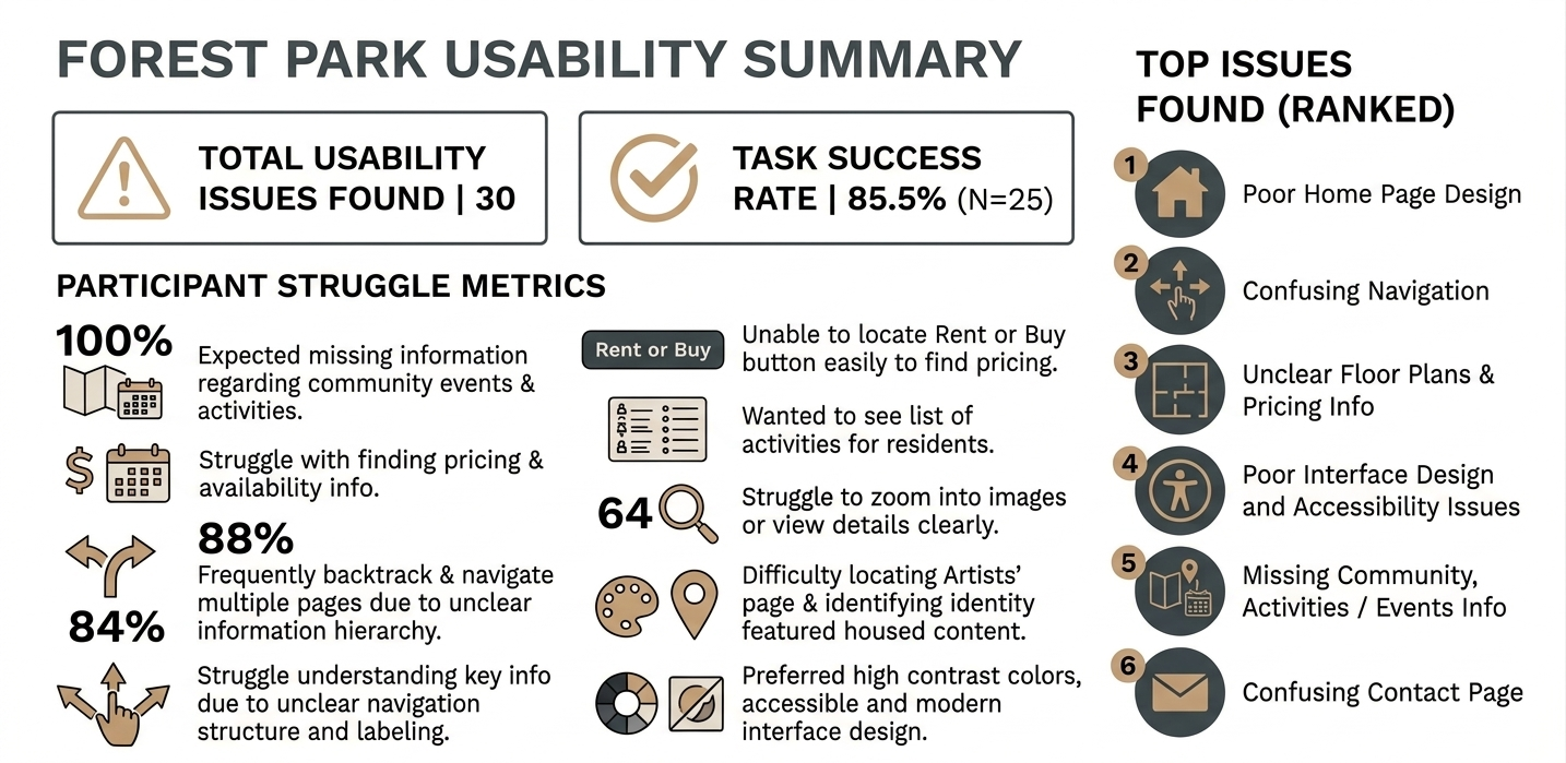
Infographic created using Google Gemini.
Redesign Recommendations
Our final high-fidelity prototype focused on resolving the critical “blocker issues” identified during testing, while maintaining absolute visual and structural consistency across the interface.
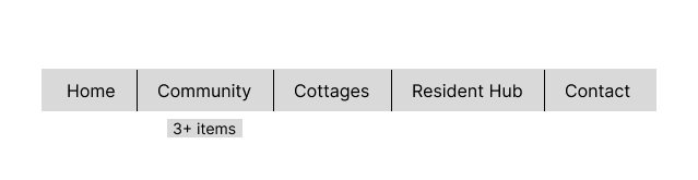
We took the bloated, unorganized 20+ items menu and condensed it into five predictable, resident-focused channels:
1. INFORMATION ARCHITECTURE
Current Navigation: Bloated & Unstructured
Redesigned Navigation: Simplified & Goal-Oriented
2. SIMPLIFIED HOMEPAGE AND UNIVERSAL NAVIGATION
The redesigned homepage gives visitors a clear starting point the moment they arrive. The navigation has been simplified and updated to reflect what the community offers today.
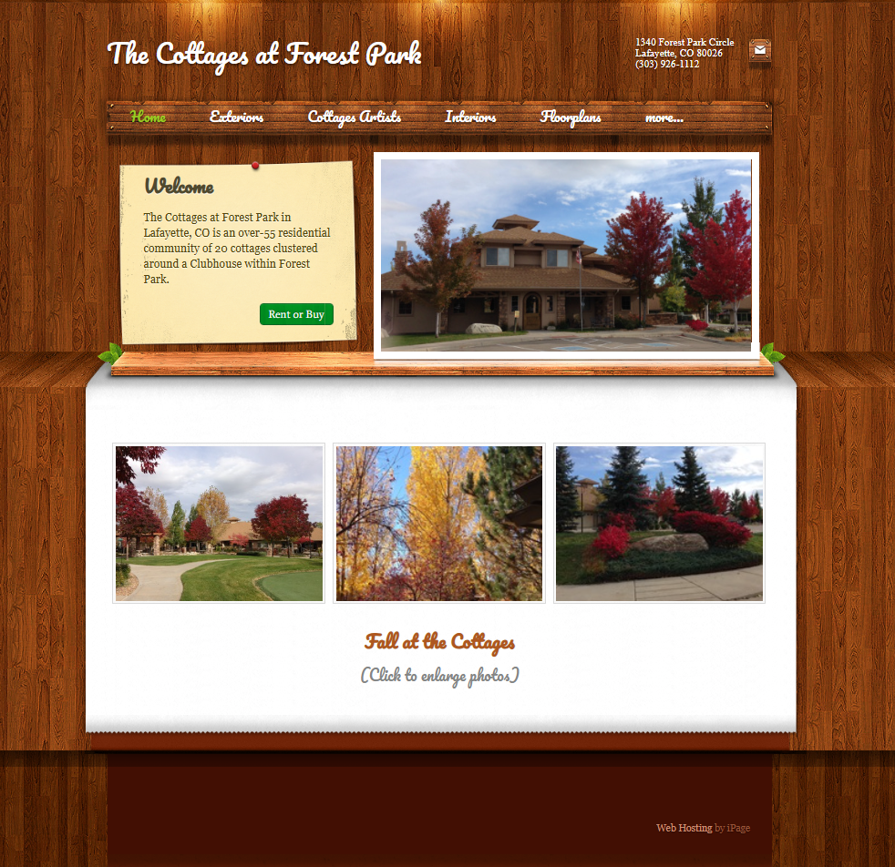
Current Home Page

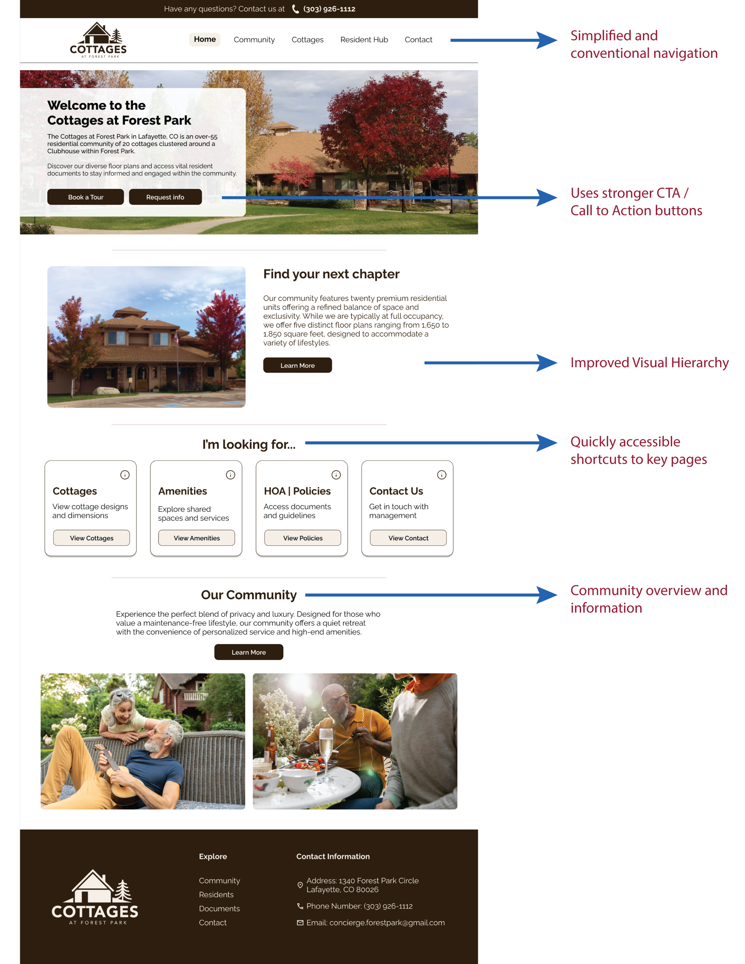
Redesigned Home Page [Prototype]
Key Changes:
Clean Typographic Scale: We replaced simulated woodgrain background and thin script fonts with high-contrast, scalable, sans-serif typefaces with plenty of white space.
Persistent Header Bar: Added a utility bar containing the community's phone number at the top of every page, so contact details are always visible.
Goal-Oriented Homepage: Implemented an "I'm looking for..." quick-navigation directly in the hero fold, routing visitors to their goals: Cottages, Amenities, HOA Policies, and Contact Us.
Footer: Designed a consistent footer that houses physical addresses, phone numbers, and alternative navigation links to anchor every page.
3. CONSOLIDATED COTTAGES / FLOOR PLANS
Users expected to find pricing, floor plans, images, and home details together in one place. Instead, the information was scattered across different pages, and key details like pricing were missing entirely.
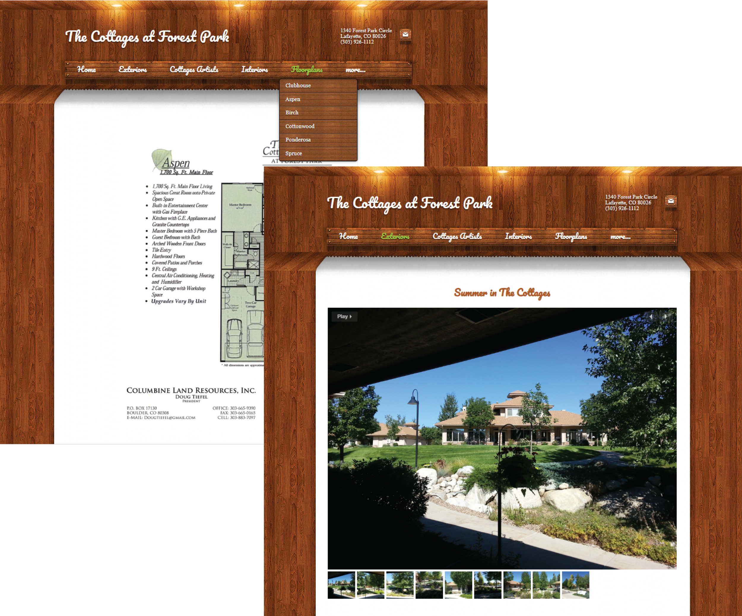
Current Floorplans and Images
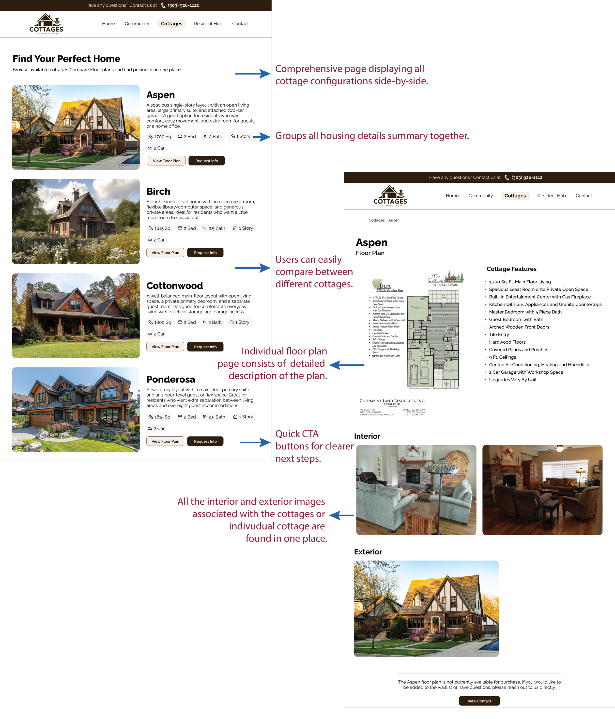
Redesigned Floor Plan Page(s)
Key Changes:
Unified Housing: Created a single page with all cottage configurations side-by-side. Each plan includes a photos, description, square footage, bedroom/bathroom details, and call-to-action (CTA) buttons.
Interactive Image Modules: Changed floor plans into interactive image modules for older adults to click any blueprint and make it bigger. This makes it easier for them to read the room sizes.
Transparent Availability Indicators: Instead of making users download a confusing Word document, we put availability information on the floor plan page. This gives people real-time information for clear next steps.
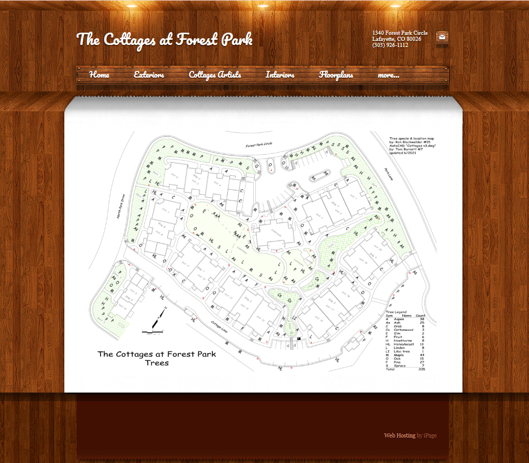
Users wanted to learn more about community life, events, amenities, and activities, but this content was either missing or difficult to find.
4. COMMUNITY LIFE AND EVENTS PAGE

Our Forest and Community Policies Page(s)
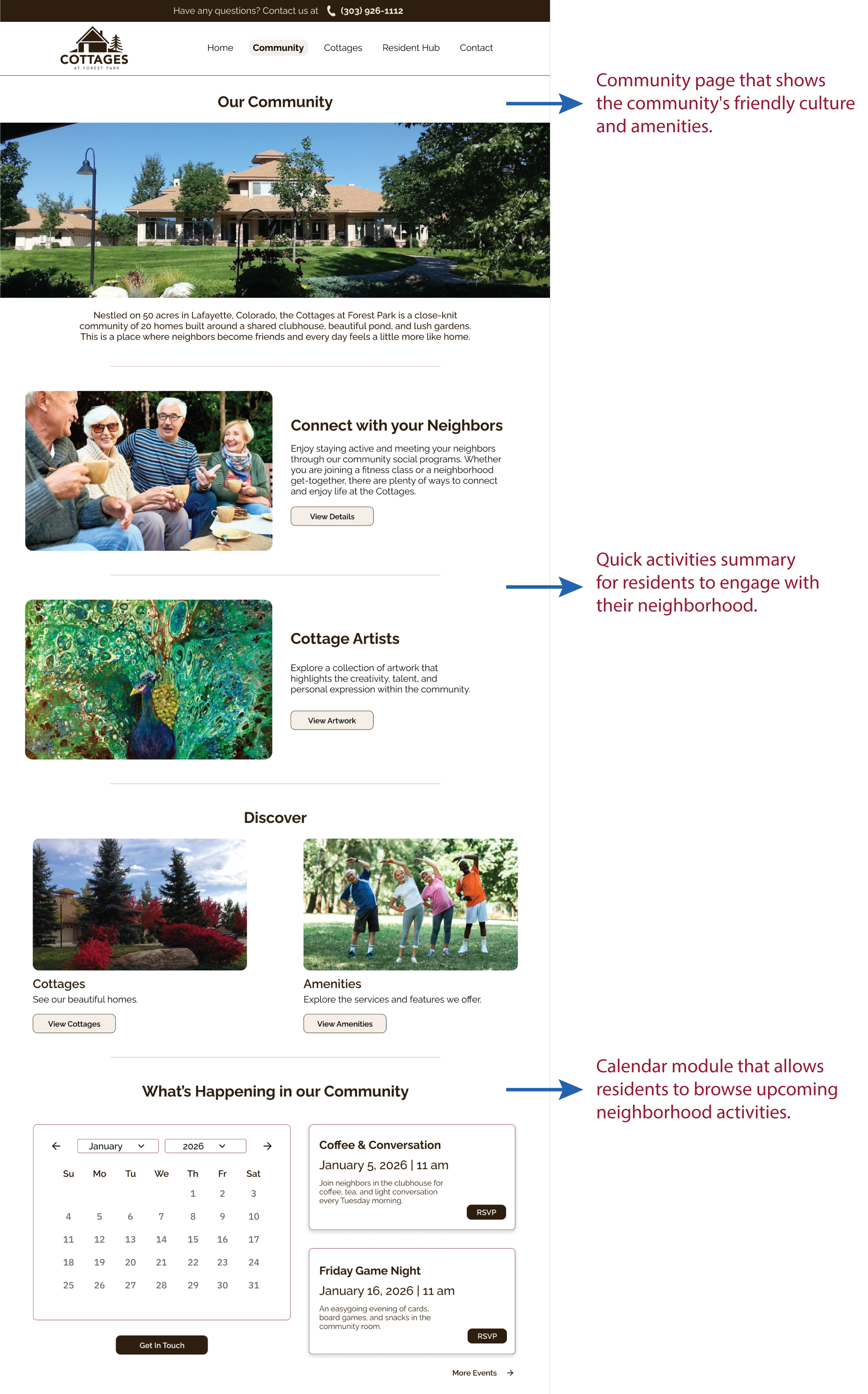
Redesigned Community/Residents’ Page(s)
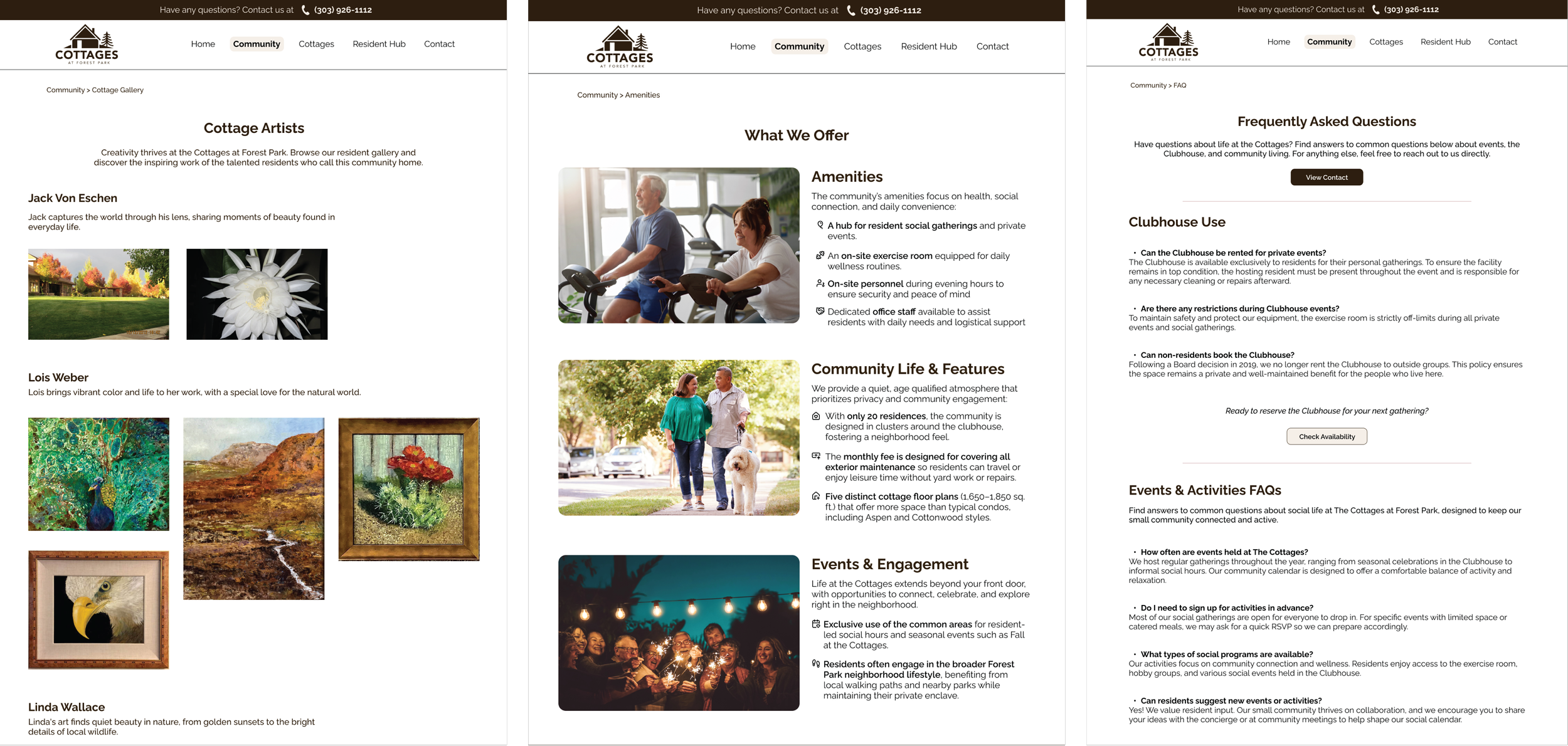
Redesigned Cottage Artists Page
Event and Lifestyle Content Page
FAQ Community Policies Page
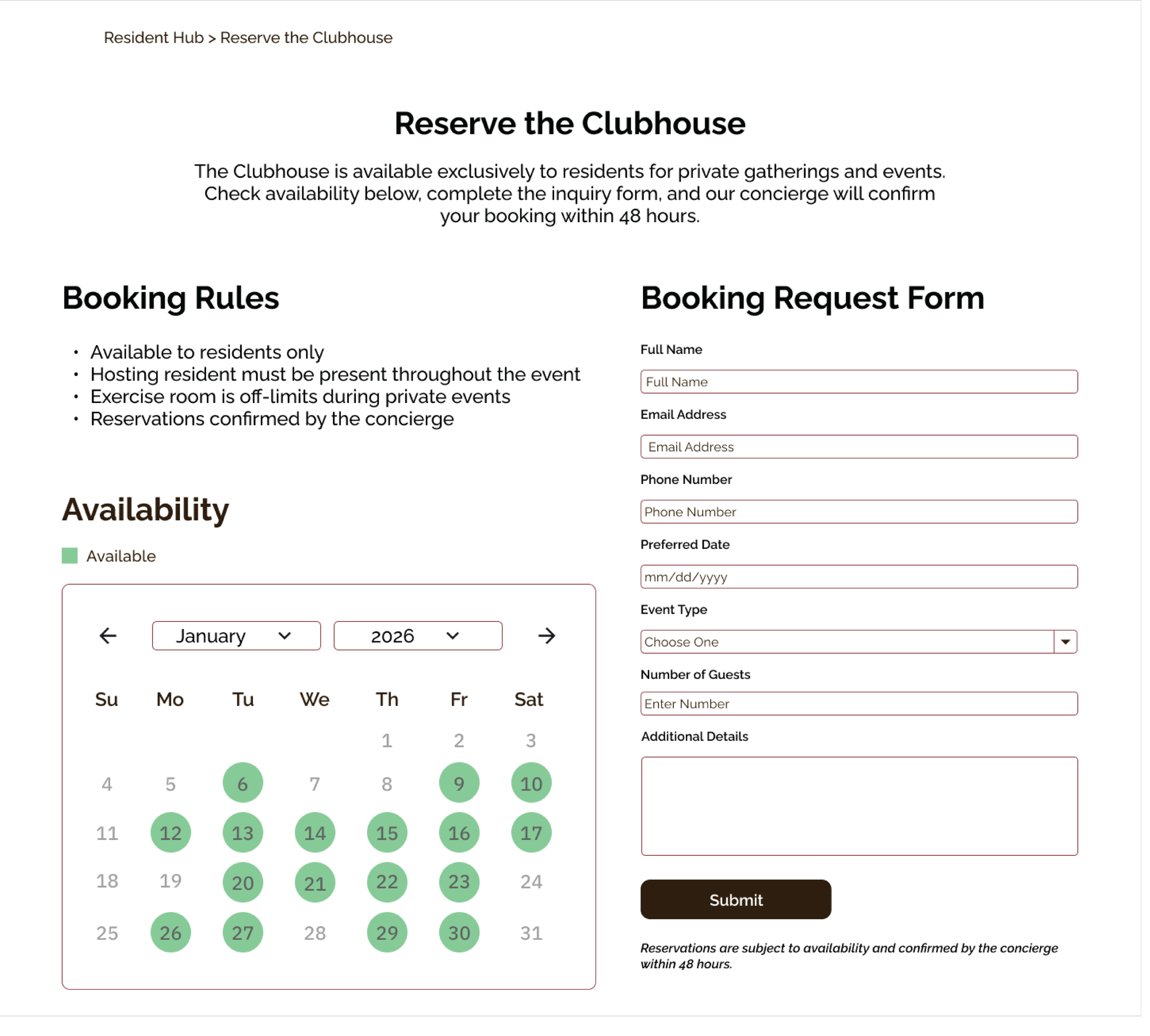
New Reserve Clubhouse Page
Key Changes:
Lifestyle: Introduced dedicated Community Life page that shows real neighborhood photography, and the community's friendly culture including social amenities and events.
Event Calendar: Added a calendar module that allows residents to browse upcoming neighborhood activities and submit on-screen RSVPs.
Digitalized Booking: Replaced downloadable policy PDFs with on-screen summary of clubhouse rules, an interactive availability calendar, and a simple digital booking form.
FAQ Policies: Added the quick Frequently Asked Questions page about the policies and community rules.
5. ACTION ORIENTED CONTACT PAGE
Users had trouble finding clear contact information and were unsure how to get help or who they would be reaching.
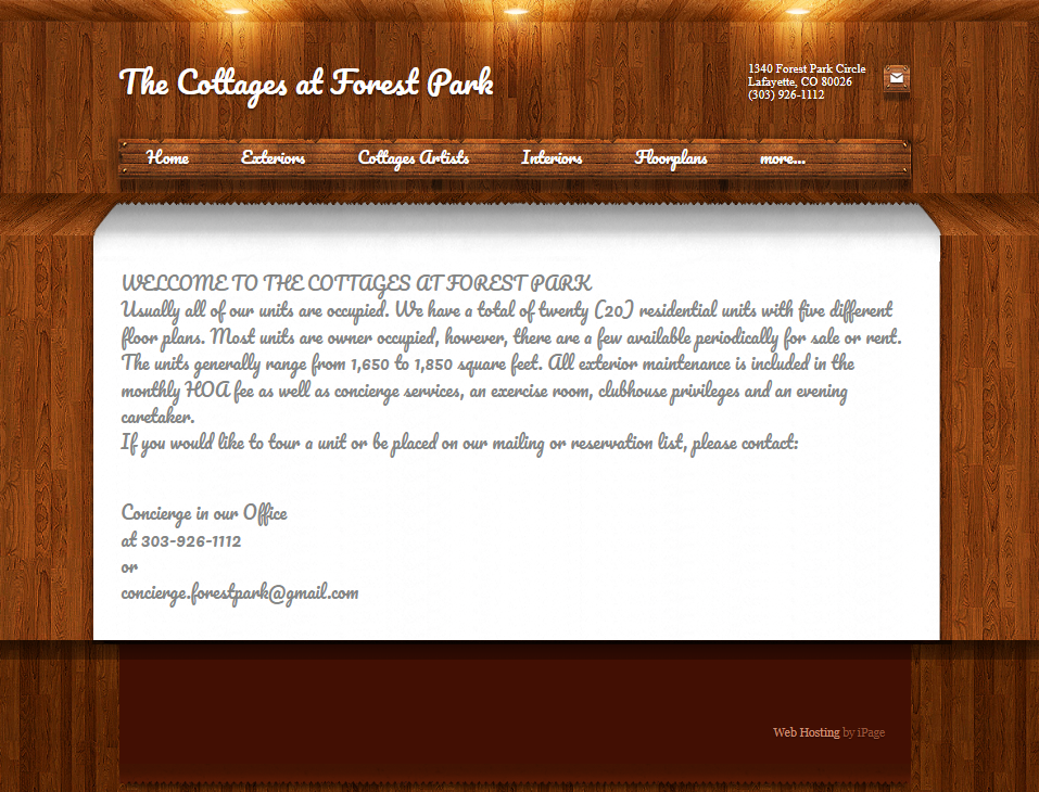
Current Contact Page
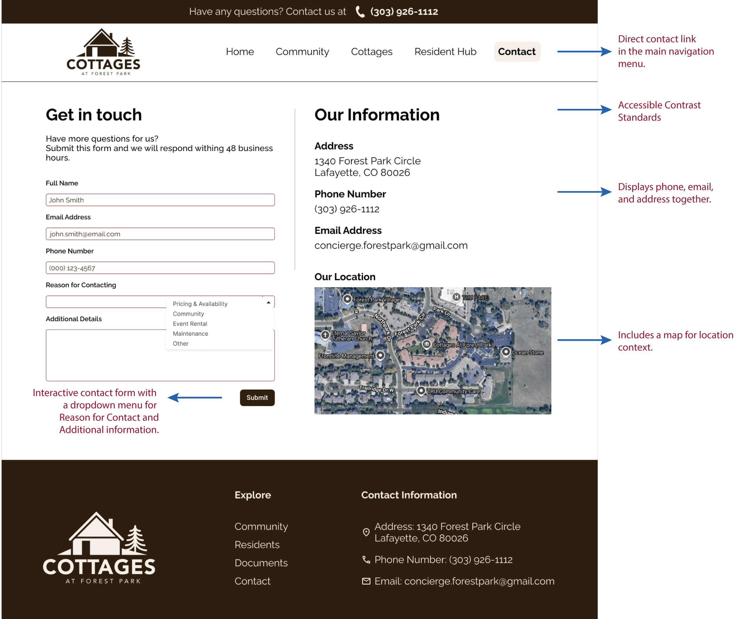
Redesigned Contact Page
Key Changes:
Contact Page: Placed a contact link in the main navigation menu and removed the hidden "More..." dropdown pattern.
Interactive Web Form: Built an interactive contact form with a dropdown menu for Reason for Contact (e.g., Pricing, Clubhouse Booking, Maintenance), routing questions to the right person.
Accessible Contrast Standards: Redesigned the contact text using high-contrast colors that exceed the WCAG AA minimum standard of 4.5:1 for comfortable reading.
Impact and Strategic Reflections
FOR THE COMMUNITY AND RESIDENTS
Cognitive Relief: Drastically lowered the interaction friction by relying on familiar design conventions (Jakob’s Law) and a logical typographic hierarchy.
Inclusivity & Accessibility: Elevating text sizes, utilizing clean sans-serif layouts, and rectifying contrast ratios ensured that older adults can navigate their own community hub easily.
Administrative Efficiency: Moving policies and booking workflows to interactive, on-page forms saves hours of manual administrative work and reduces phone and email backlogs for community volunteers.
WHAT I LEARNED (RETROSPECTIVE)
The Need for In-Person Testing: Remote testing was highly effective, but conducting in-person tests with active senior residents in their homes would have provided deeper insights into how physical devices and home internet connections affect their browsing routines.
The Mobile-First Challenge: Older users interact with mobile devices differently (often using larger system text or unique zoom styles). Designing layouts that remain unbroken under extreme system zoom configurations is a critical requirement for a senior audience.
NEXT STEPS FOR THE PLATFORM
Prototype Validation: Conduct a round of usability testing on our redesigned high-fidelity prototype with a new panel of 25 participants to measure improvements in completion speeds and error rates.
Secure Resident Portal: Expand the design to include a password-protected resident hub where residents can pay dues, review private board minutes, and submit maintenance logs on one secure platform.