CASE STUDY
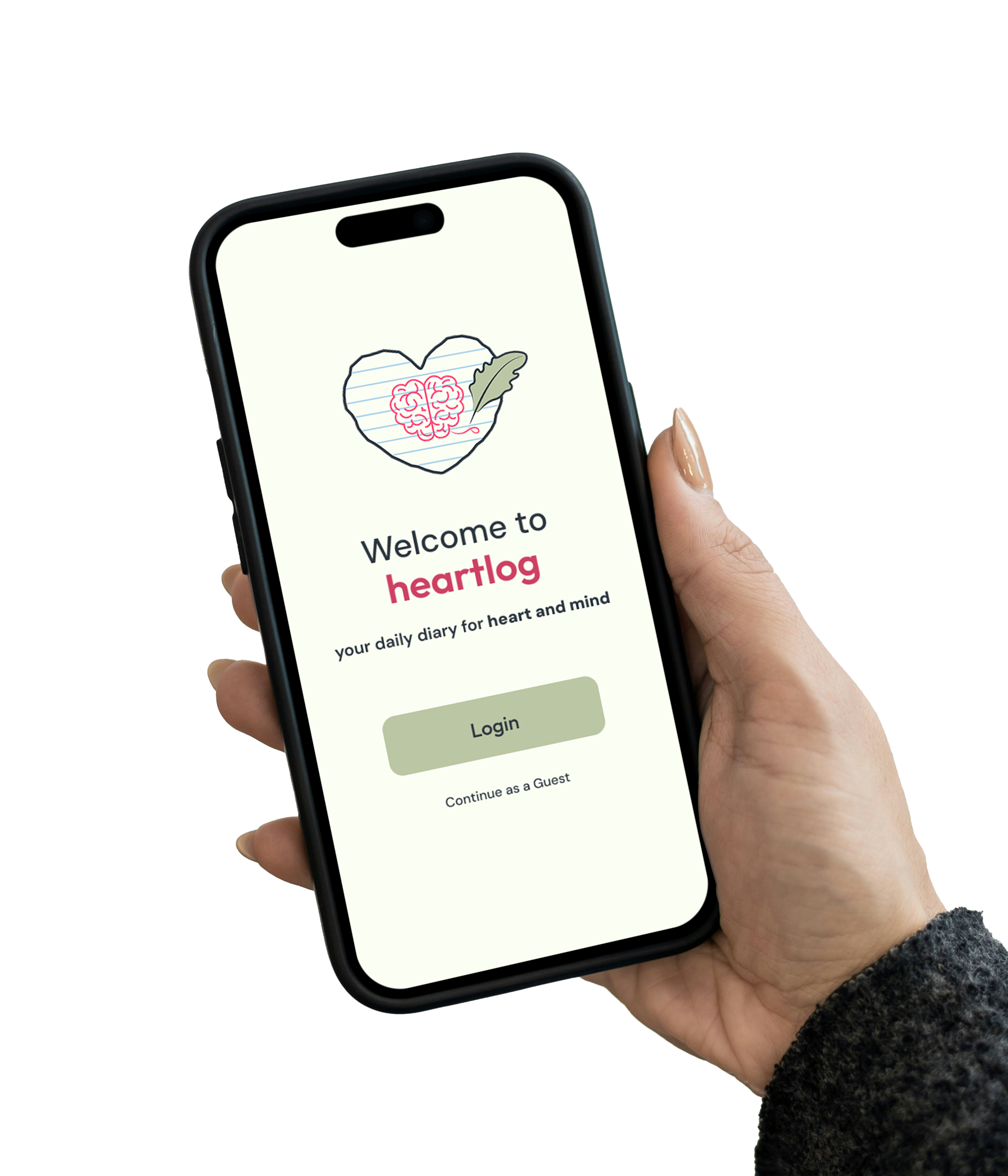
Heartlog: A soft place for your thoughts - App Design
Overview
I designed the Heartlog application to rethink the digital journal. Using my background in psychology, I designed this iOS app to move away from the clinical, high-pressure feel of most mental health tools. It focuses on gentle prompts and a calm, inclusive interface to help users check in with themselves without feeling overwhelmed.
This project was a deep dive into the full design lifecycle from initial research and custom illustration to professional usability testing and high-fidelity prototyping.
Application Idea
This project began in my Cross Media Design Solutions course (GIT 540). While the class was focused on using cross-media design approaches using Adobe Creative Suite and Figma to create projects and build a portfolio website, I wanted to push myself further.
I decided to design a mobile app from scratch, which was something that had not been covered in our sessions yet. I chose to create Heartlog application, a gentle space for people to track their moods and thoughts without the pressure of a traditional journal.
The Challenge
Most people know that writing helps with stress. Many mental health apps feel too clinical, cluttered, or demanding. My goal was to take the logic of UX and give it a soul. I wanted to build an experience that feels therapeutic rather than administrative, making sure technical systems still feel like they were made for people.
Literature Review
Research shows that expressive writing and mood tracking improve emotional awareness and reduce stress, but only when the experience feels approachable and easy to maintain.
BACKGROUND RESEARCH
Expressive Writing
Writing about emotions and stress can boost immune functioning and help people interpret their experiences rather than just venting.
Source: APA - Writing to Heal https://www.apa.org/monitor/jun02/writing
Overcoming the Blank Page
Research-based strategies like gratitude journaling and specific prompts build long-term resilience and solve the "what do I write?" hurdle.Source: Greater Good - How Journaling Helps Manage Stress https://greatergood.berkeley.edu/article/item/how_to_journal_through_your_struggles
Self-Awareness
Self-tracking mood increases awareness and proactive self-regulation of emotional well-being.
Source: NCBI - Mood Tracking and Self-Awareness https://pmc.ncbi.nlm.nih.gov/articles/PMC5977660/
Low-Pressure Design
Effective mental health technology focuses on self-management and skill training without the friction of clinical data collection.
Source: NIMH - Mental Health Apps https://www.nimh.nih.gov/health/topics/technology-and-the-future-of-mental-health-treatment
Research Highlights
Through informal interviews and competitive analysis, I found that users often feel graded by complex health apps.
They needed:
A fast way to check in.
Guidance that felt optional.
A clear, soft interface that didn't add to their mental load.
User Flow & Information Architecture
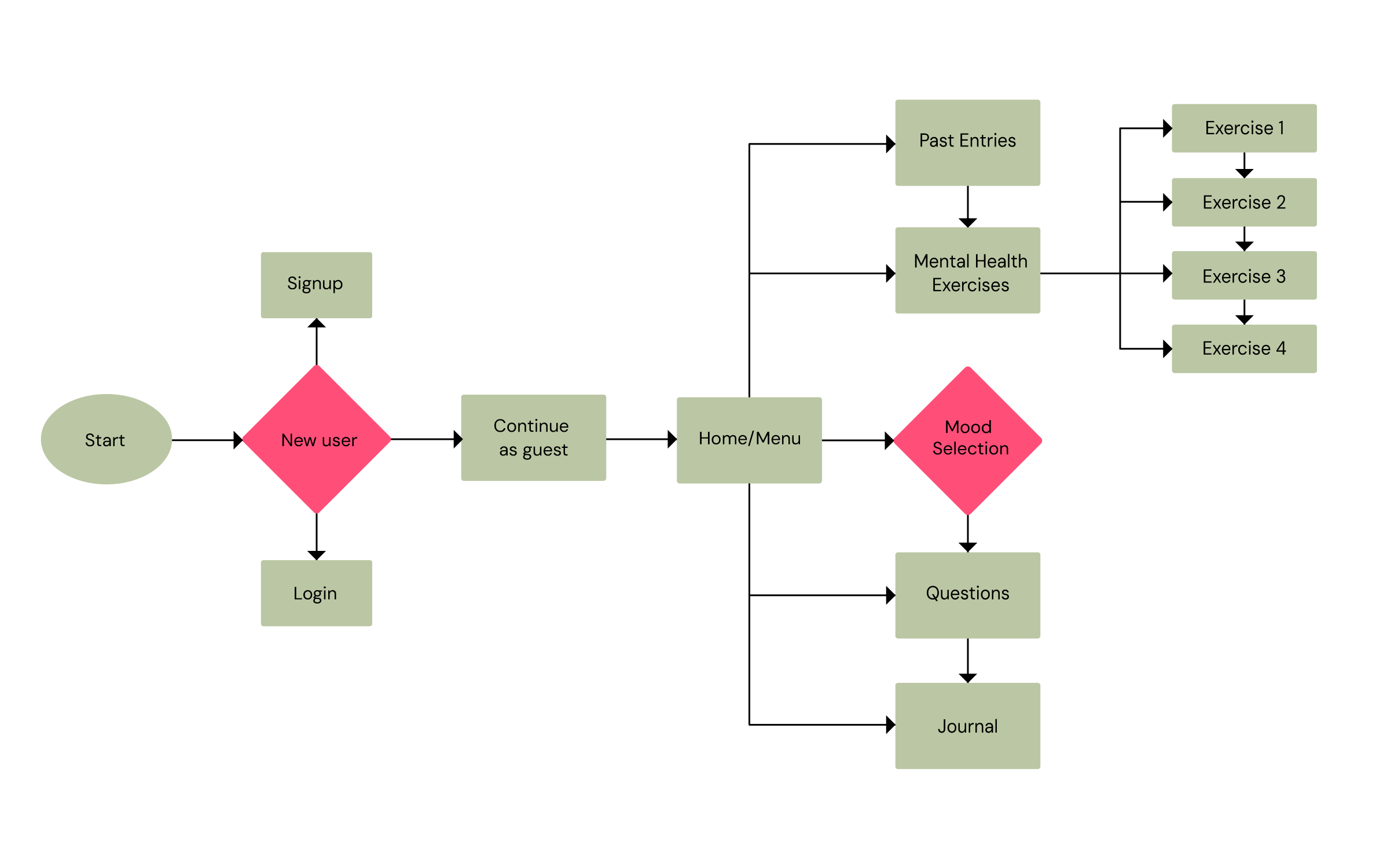
The core of Heartlog's usability is its non-linear structure. I designed a flow that gives them immediate control.
Reducing Friction: The flow begins with a decision point for entry. Users can log in, sign up, or skip the process entirely via guest access. This is especially important for mental health tools, where a long sign-up process can be a deterrent.
The Central Hub: I implemented a Home Menu that acts as the primary anchor. This allows users to jump between mood tracking, journaling, past entries, or mental health exercises based on their immediate needs.
Simplified Interaction: By mapping the flow, I was able to identify redundant screens. I reduced the mood questions from three separate pages to a single, continuous scroll, significantly shortening the path to the main task.
Iterative Process
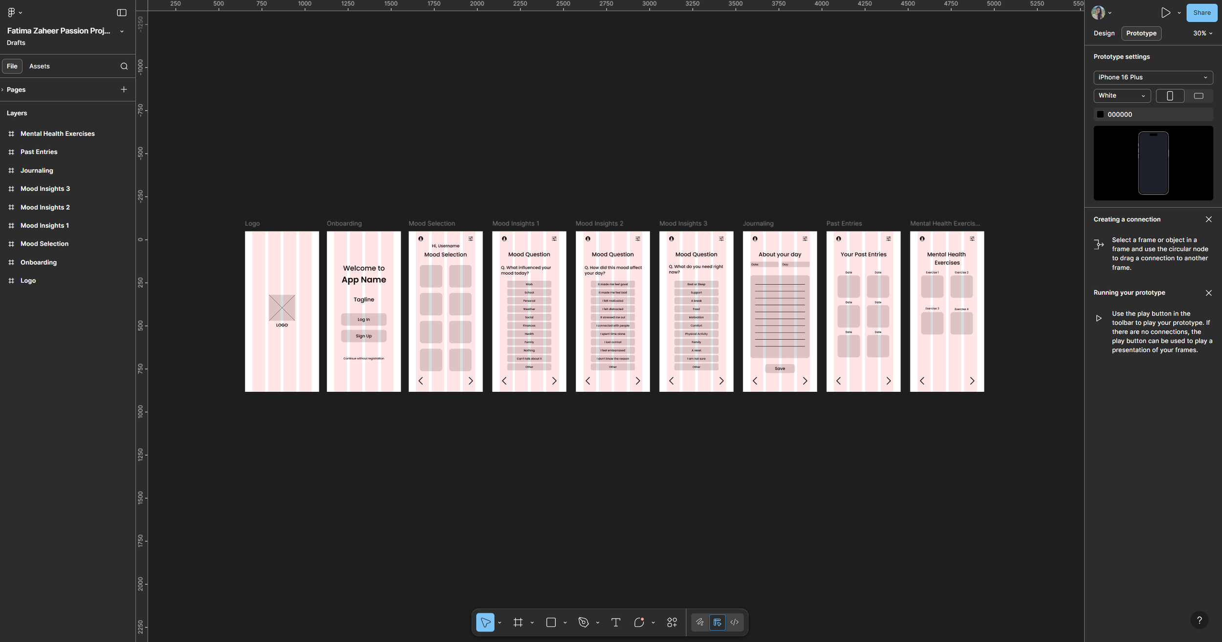
LOW FIDELITY
Laying the Groundwork, I started with sketches to map out the flow for an iPhone 16 Plus. Early feedback from a digital artist showed that my writing screens were too cramped. I expanded the space to let thoughts breathe and clarified where user data would live.
MID FIDELITY
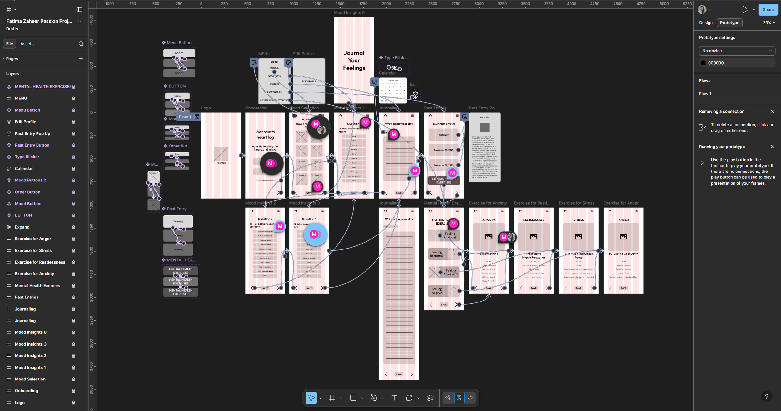
Refining the Logic in Figma, I built interactive buttons to test the navigation. I consulted with professionals and peers for usability testing and feedback, who helped me see that my flow was a bit too long with many discrepancies. I condensed three separate screens into one scrolling page to prevent app fatigue.
I also made the mood picker more flexible, allowing users to select multiple emotions at once. After carefully considering all recommendations, I made changes to the UI and UX design as required.
HIGH FIDELITY
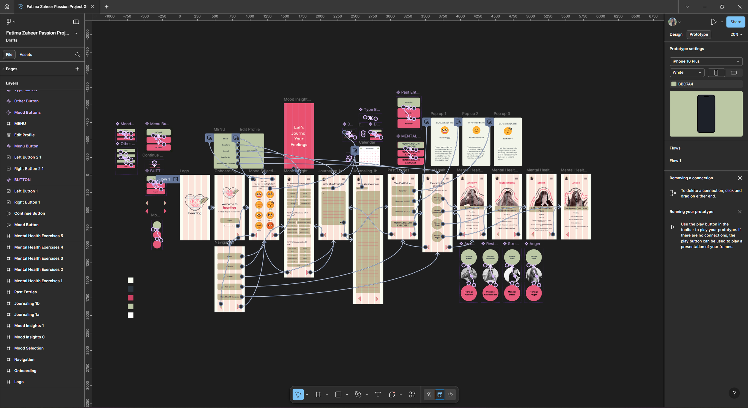
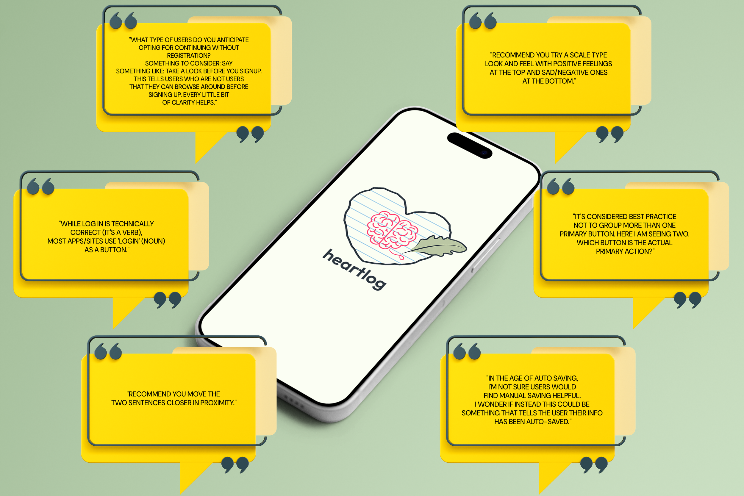
I got my project reviewed by a Senior Product Designer to ensure the app met industry standards. I removed competing buttons to reduce choice paralysis and added a “Continue as Guest” option to lower the barrier for new users. I also swapped the manual “Save” button for an auto save feature to make the process feel effortless.
Deliverables and Technical Execution
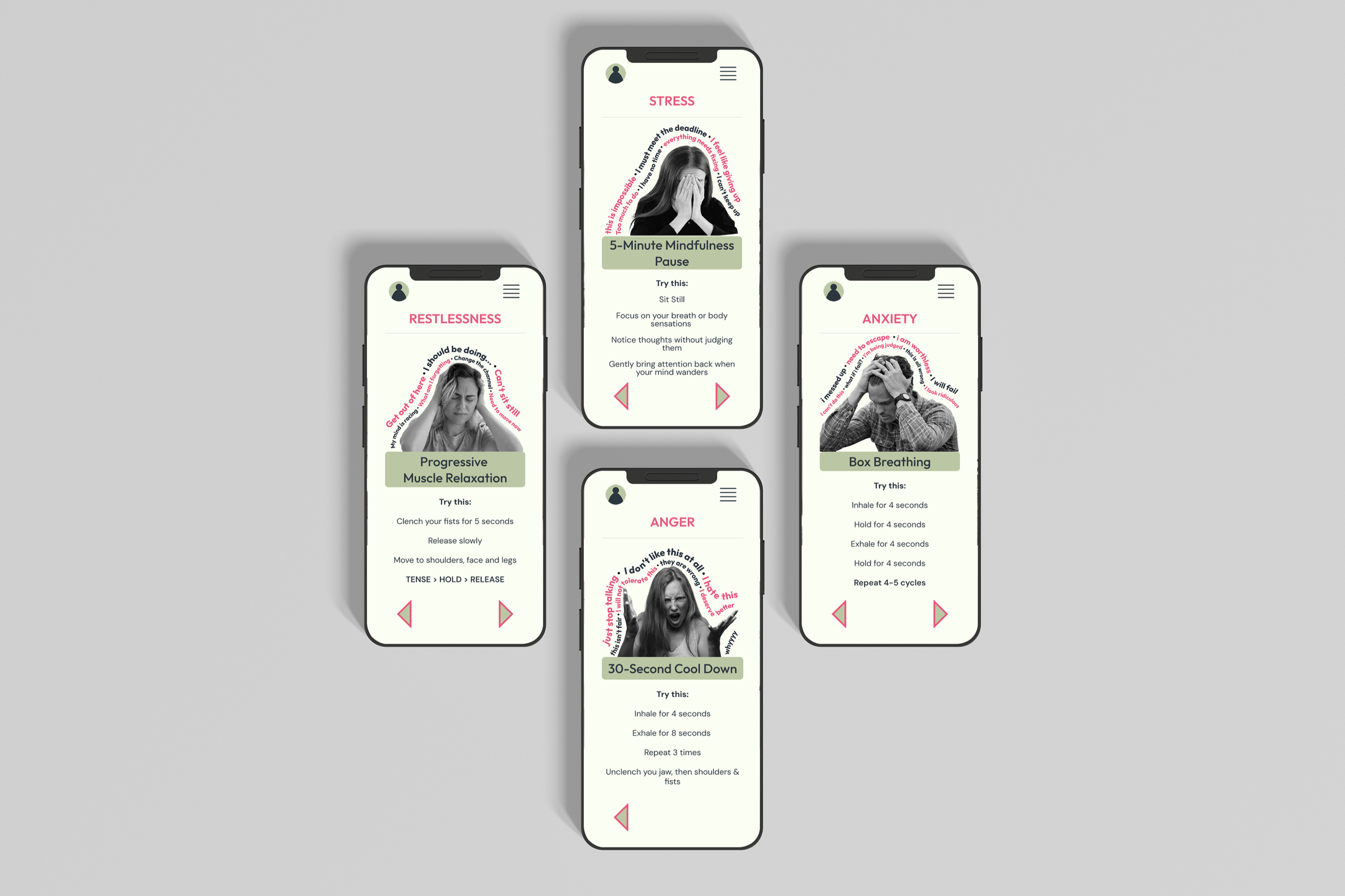
I built the final prototype to be modular, meaning the exercise and journaling sections can grow without cluttering the interface.
Modular Exercises: The exercise section is built to scale, offering multiple specific activities to support different needs.
Integrated Assets: I ensured that every custom icon and edited image served a purpose within the flow, guiding the user's eye toward the next action.
Software Used
ADOBE ILLUSTRATOR
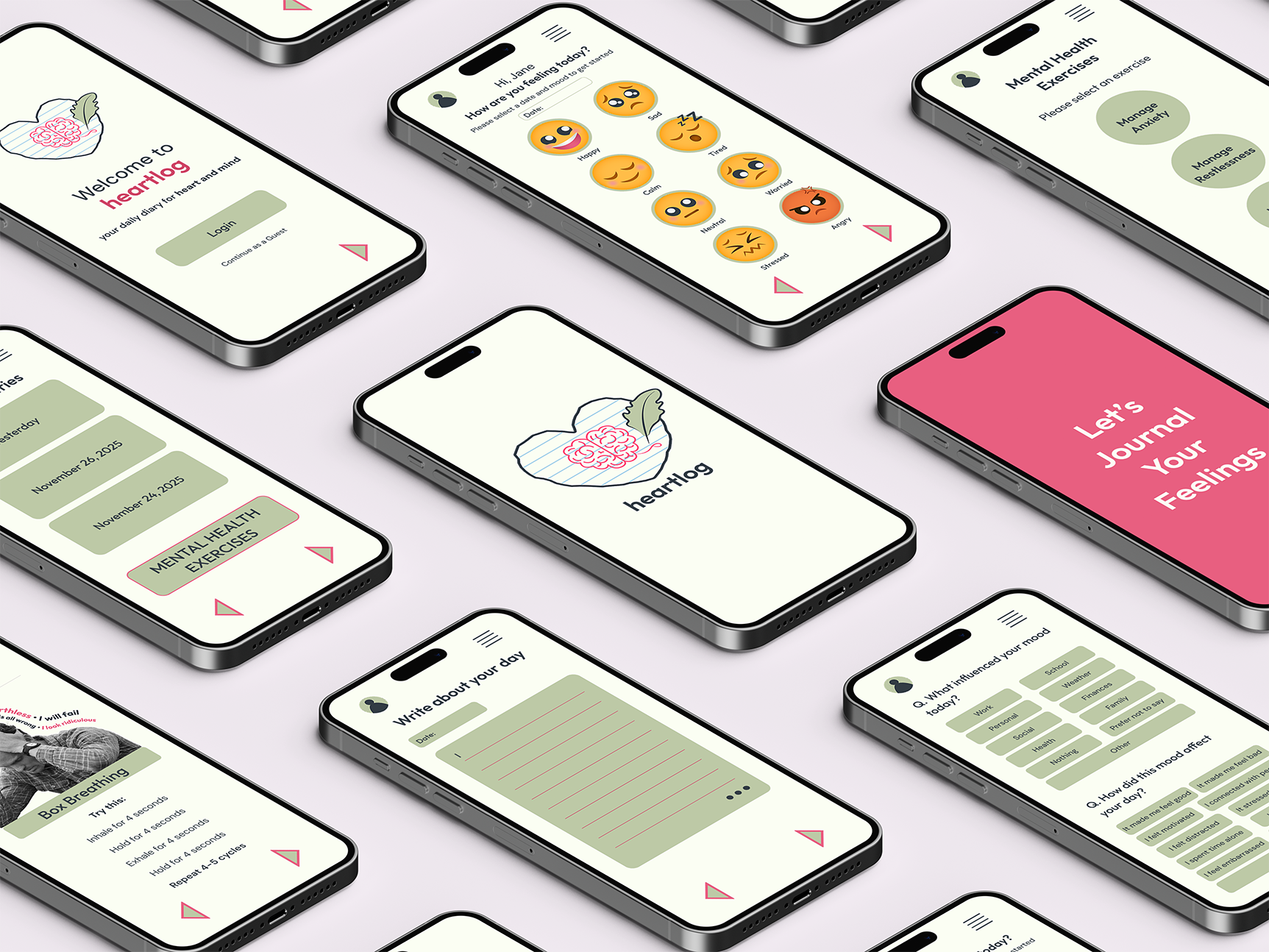
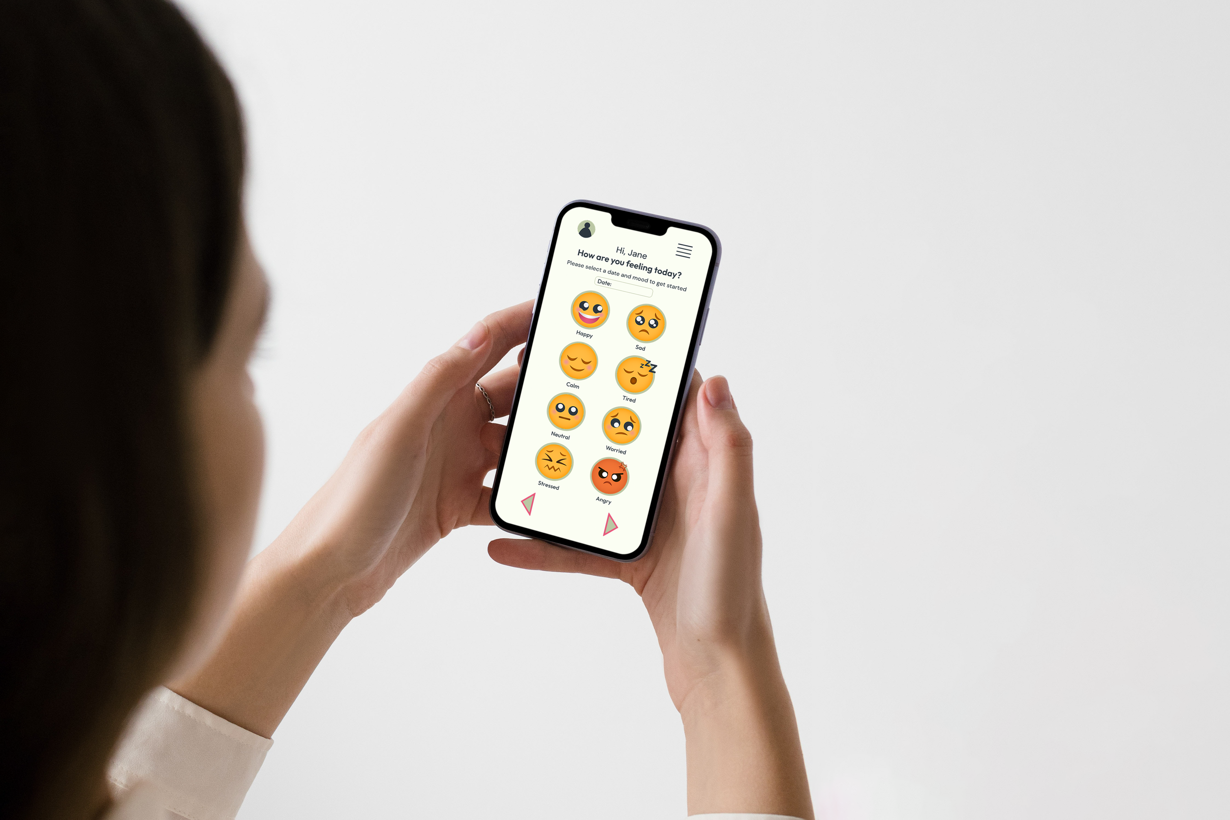
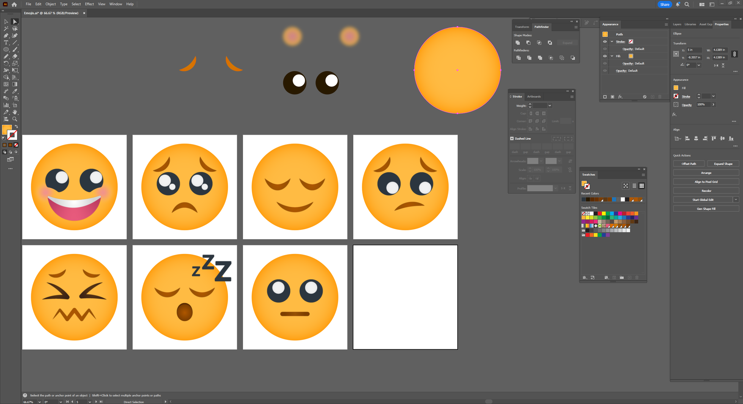
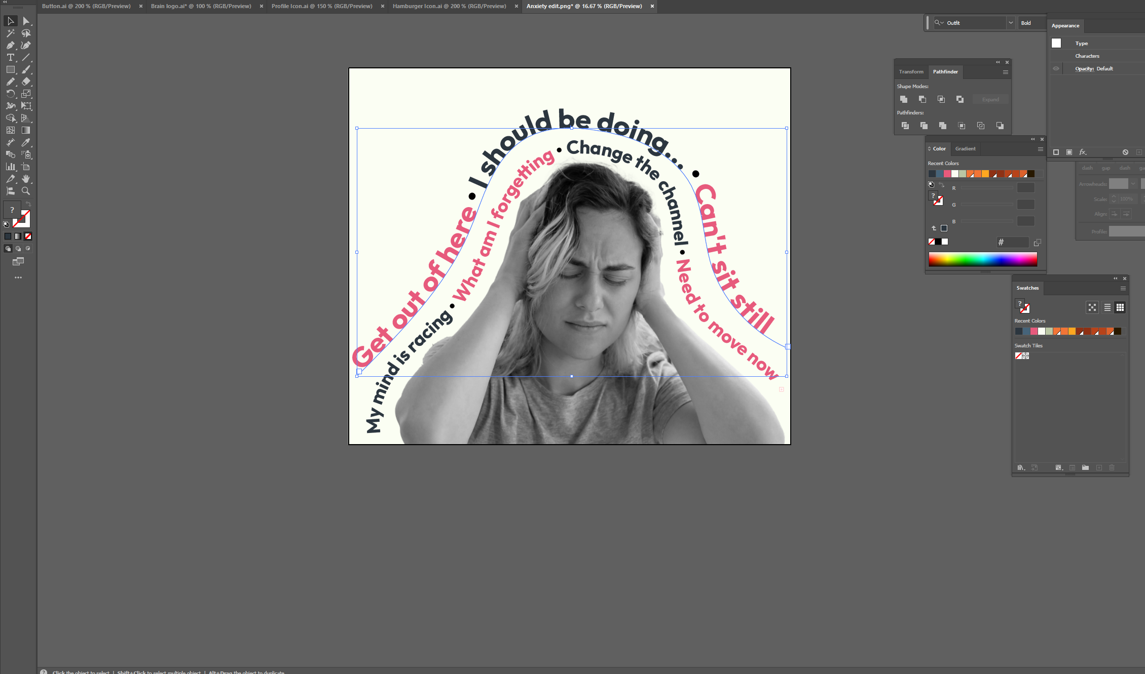
I designed the heart brain logo and hand-built every icon from scratch. I illustrated eight custom emojis, applying a Gaussian Blur to give them a softer, more human look. I also used the Type on a Path tool to wrap text around my edited images.
ADOBE PHOTOSHOP
I designed the heart brain logo and hand-built every icon from scratch. I illustrated eight custom emojis, applying a Gaussian Blur to give them a softer, more human look. I also used the Type on a Path tool to wrap text around my edited images.
FIGMA
This was the hub where I built the prototypes. I used a Contrast Checker plugin to ensure every color choice was accessible and inclusive.
Usability Testing and Feedback
Testing with professionals and peers was vital.
Accessibility: I added text labels to my emojis so they are easier to understand.
Visual Identity: While some suggested a higher contrast palette, I kept my sage green theme because it met accessibility standards while maintaining the calm, “soft” feeling I wanted for a mental health tool.
Navigation: Based on peer feedback, I added a central Home navigation page so users can jump straight to exercises or past entries whenever they like.
Results
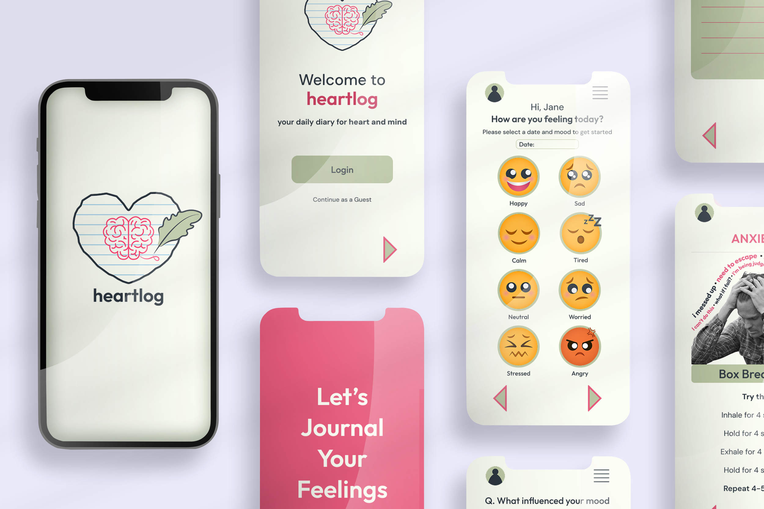
The final version of Heartlog is a cohesive, clean, and professional application. It successfully bridges the gap between technical UX and personal visuals. By listening to feedback, I created an app that stays out of the user's way and provides a truly quiet space for reflection.
Reflection
Building Heartlog taught me that good design comes from constant testing and listening to different professional opinions. By going beyond the class requirements to create a mobile app, I learned how to handle the full life of a project. I managed everything from the initial psychological research and sketches to making the final assets.
This process showed me the value of knowing when to simplify. I had to learn to remove features like a manual save button or extra screens to help keep the user calm and focused. Ultimately, this project proves I can combine my skills in Figma and Adobe with a deep understanding of people to solve actual problems.