MINI CASE STUDIES
Illustrations
This collection brings together a mix of university and personal creative work focused entirely on illustrations and visual design. Everything here was built from scratch, inspired by existing web designs or assigned coursework. Famous artworks or existing designs featured in these projects are recreated solely for practice to master the software.
The workflow starts with rough sketches, moves into custom vector artwork and image editing, and finishes with clean multi page print layouts. The goal across all these projects was to keep the styling consistent while handling everything from typography choices to final asset management.
Case Study 1
3D Mario Vector Illustration
Important Information
Institution: Karachi School of Art
Project: Graphic Design Certificate (2022)
Tool: Adobe Illustrator (Mesh Tool)
Original Character Design Credits: Created by Stephen Hillenburg for Nickelodeon.
Technical Reconstruction: Hand-built vector art by Fatima Zaheer
Overview
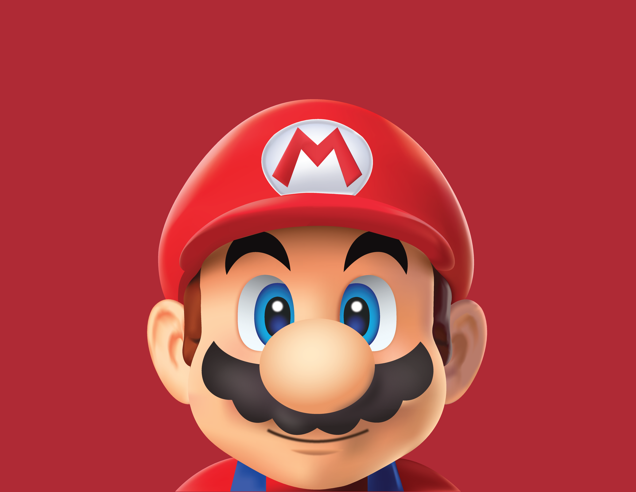
The goal of this project was to push the boundaries of vector art by taking a 2D software and creating a photorealistic, 3D result. I chose to recreate the iconic Super Mario because of the complex organic shapes and the variety of textures, from the soft skin tones to the fabric of his hat.
Original Credits: Character design is property of Nintendo.
Creative Focus: My personal challenge was to prove that vector art doesn't have to look flat. I wanted to demonstrate how mathematical paths can be manipulated to mimic real world lighting.
The Technical Challenge: The Gradient Mesh Tool
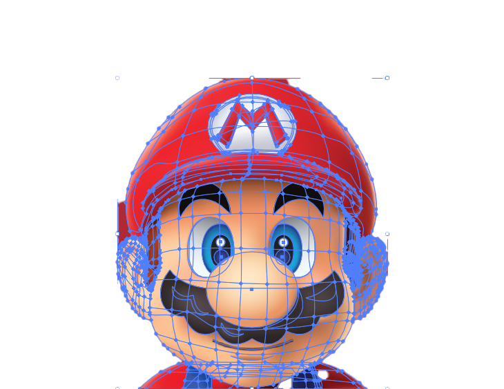
Recreating Mario using the Mesh Tool is widely considered one of the most difficult techniques in Adobe Illustrator. Unlike standard gradients that move in a straight line, a Mesh allows you to drop points onto a shape and assign each point its own color, creating a complex web of tones.
Patience and Precision: This wasn't a project that could be rushed. It took several days of intense focus to get the anatomy right. Every curve of Mario’s nose, the roundness of his cheeks, and the dip in his chin required a custom mesh grid.
Light and Shadow: To achieve a true 3D effect, I had to manually paint with nodes. I spent hours fine tuning the highlights on his nose and the deep shadows under his hat. If a single mesh point was slightly out of place, the entire 3D illusion would break.
Complexity of Form: The ears and the M emblem on the hat were particularly difficult. I had to manage multiple overlapping meshes to ensure the colors blended naturally without creating jagged edges or muddy colors.
Expertise and Craftsmanship
This project represents a high level of technical expertise. It requires more than just knowing how to use a mouse; it requires an artist's eye to understand where light hits an object and how shadows wrap around a sphere.
Total Control: Every part of this Mario from the blue of his eyes to the texture of his mustache is 100% vector. This means the image can be scaled at maximum without losing quality.
The Result: After days of refining the mesh points, I achieved a soft and rendered look that requires 3D software like Blender, but I did it entirely within a 2D vector environment.
Reflection
This project from my time at the Karachi School of Art in 2022 remains one of my proudest achievements. It taught me that design is about discipline. Spending days on a single character helped me master the Mesh Tool and gave me the confidence to tackle any complex technical challenge in my career.
Case Study 2
Photorealistic Mustang Vector Illustration
Overview
Project Type: Technical Mastery Exercise
Tool: Adobe Illustrator (Pen Tool)
Focus: High-Fidelity Vector Construction
VISION AND IDEA
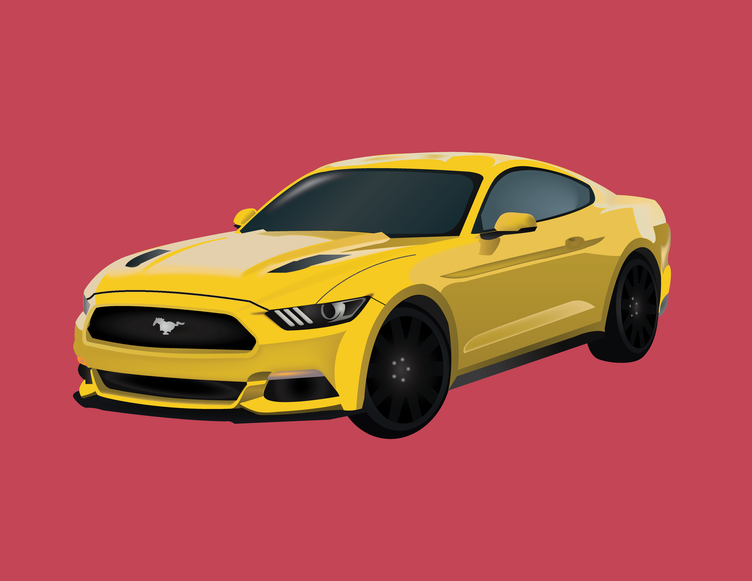
The goal of this project was to take a standard automotive photograph and translate it into a scalable vector illustration. I chose a modern Ford Mustang because of its iconic sharp lines, complex reflections, and the challenge of representing high-gloss metallic paint using only vector paths.
Original Credits: The reference image is based on the Ford Mustang automotive design.
Creative Focus: My aim was to achieve a photorealistic look through extreme detailing by manually drawing every reflection, highlight, and mechanical component to create a sense of depth and speed.
The Technical Challenge: Precision Pen Tool Work
This entire car was built using the Pen Tool. This is one of the most technical ways to illustrate because it requires an immense amount of patience to plot every single anchor point by hand.
Vector Details: If you look closely at the headlights and the grille, you will see dozens of tiny, individual shapes. I manually constructed the internal housing of the LEDs and the texture of the front intake to ensure the car looked real even when zoomed in.
Complex Reflections: One of the hardest parts of automotive illustration is the paint. I had to draw individual vector shapes for the sky reflections on the hood and the ground reflections along the side panels. By layering these shapes with varying opacities, I was able to mimic the way light wraps around a curved metal surface.
Wheel and Tire Construction: The wheels were particularly technical. I used the Rotate Tool and Pathfinder to ensure the spokes were perfectly symmetrical, then added manual shading to each one to give them a metallic, three-dimensional finish.
Expertise and Craftsmanship
This project demonstrates digital craftsmanship. It isn't only about tracing; it’s also about understanding the anatomy of a car.
Layer Organization: Because there are hundreds of tiny paths (for the pony emblem, the tire treads, and the window tints), I kept a layer hierarchy. This allowed me to tweak the lighting on the body layer without accidentally moving the wheels.
Color Theory: I used a vibrant yellow base but supported it with a range of amber, gold, and deep charcoal tones to create the highlights and shadows that give the car its weight.
Scalability: Because this is 100% vector, this Mustang can be scaled to a big billboard without any pixelation or loss of detail.
Reflection
Building this Mustang was a lesson in discipline. It required me to slow down and look at the fine print of a photograph. By focusing on the tiny details like the glint of light on the side mirror or the shadow under the spoiler, I was able to create a piece that feels powerful and polished. It remains a core example of my ability to handle high-pressure and detail-oriented technical projects.
Case Study 3
SpongeBob Vector Inspiration
Important Information
This project for GIT 540 was a dive into technical precision. The goal was to recreate the character Spongebob Squarepants using Adobe Illustrator. This was a lab exercise particularly designed to test how well I can control the software’s core tools to match a professional reference exactly.
Original Character Design Credits: Created by Stephen Hillenburg for Nickelodeon.
The Challenge: Building by Hand
Original Credits: Character design is property of Nickelodeon.
To get the character looking right, I broke it down into layers:
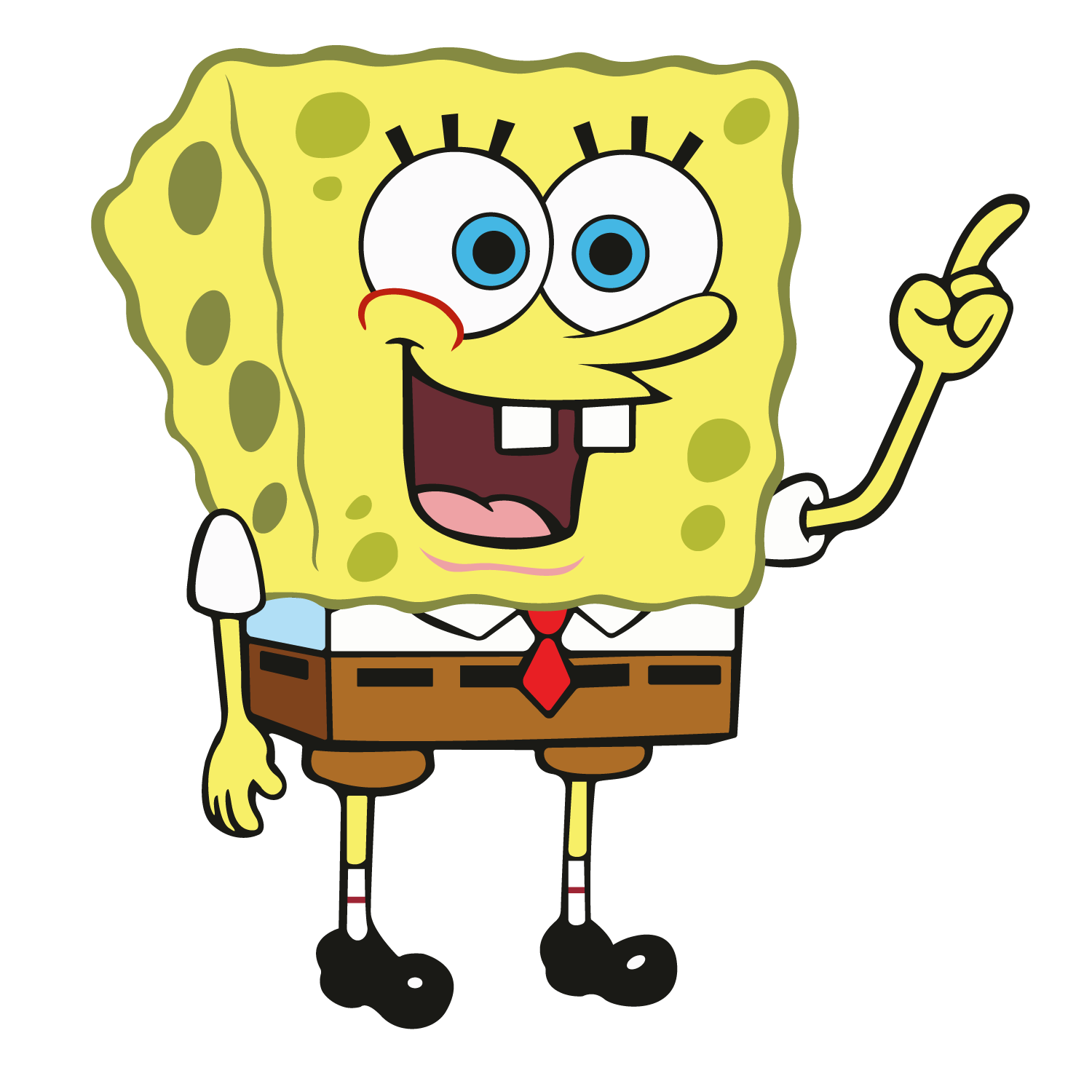
The Foundation: I started with the main body using the Rectangle Tool and then used the Direct Selection Tool to tweak the corners and give him that iconic sponge silhouette.
The Details (Pen Tool): For his wavy body outline, nose, and mouth, I used the Pen Tool. This took the most patience, as I had to make sure the curves were smooth and matched the original artwork's line weight.
Pathfinder & Shape Builder: To create his eyes and the holes in the sponge, I layered circles and used the Pathfinder tool to punch shapes out or merge them together.
Color Matching: I used the Eyedropper Tool to pull the exact shades of yellow, brown, and Spatula Blue from the reference image to ensure 100% accuracy.
Technical Side
A major part of the grade was about how clean the file was. I had to:
Organize Layers: I couldn't just have one messy layer. I grouped everything logically, one layer for the “Face,” one for the “Clothes,” and one for the “Body.”
Outline Strokes: I used the Outline Stroke command to turn my lines into solid shapes, which is a professional standard for vector art.
Cleanup: I made sure there were no stray points or hidden shapes left over from the building process.
Reflection
Recreating a famous character is harder than it looks! This project taught me that great design is often about the small details, the curve of a line or the way two shapes overlap. It really strengthened my muscle memory with the Pen Tool and taught me how to look at a complex image and break it down into simple, manageable shapes.