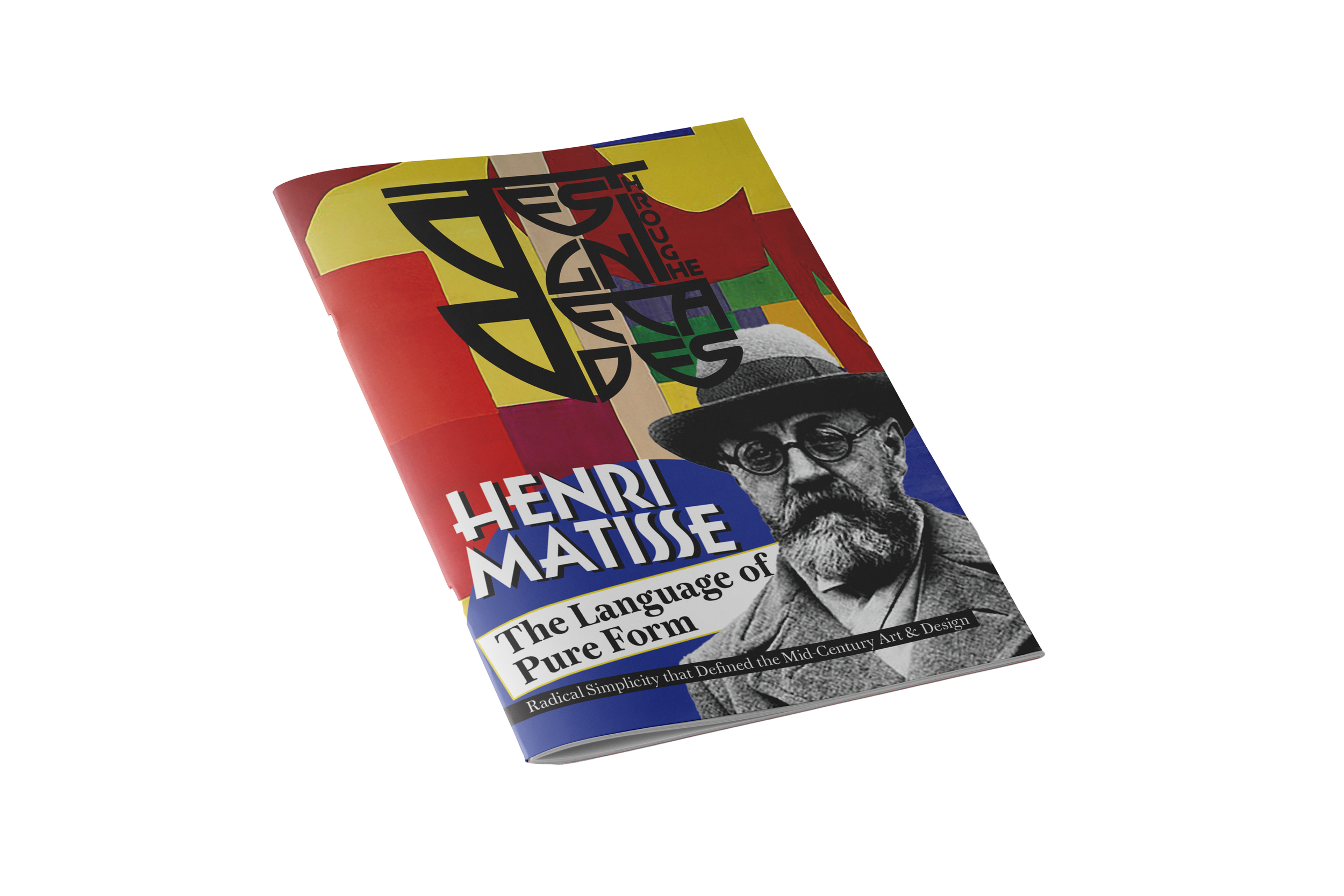
CASE STUDY
Magazine Design featuring Henri Matisse
This project involved the creation of a scholarly article and a corresponding magazine layout about the artist Henri Matisse, using both detailed academic research and writing alongside a refined, multi-media design strategy.
Project Objectives
The main objective of this project was to design a professional and visually engaging magazine layout and typographic logo that successfully captured Henri Matisse's unique artistic style and significance. The other goal was to write an insightful scholarly article about the chosen artist (Matisse, the Fauvist) that strictly followed APA formatting standards. I selected Matisse because his art deeply resonated with me through its expression of form and emotion.
The final deliverable was required to meet the intellectual and visual design standards of its target audience i.e., members of the design community interested in art history. The audience required a sincere analysis of the artist's relevance to digital design industry practices today. Consequently, the project demanded technical accuracy in the design elements and intensive analytical depth in the written content.
Process
LITERATURE REVIEW AND ANALYSIS
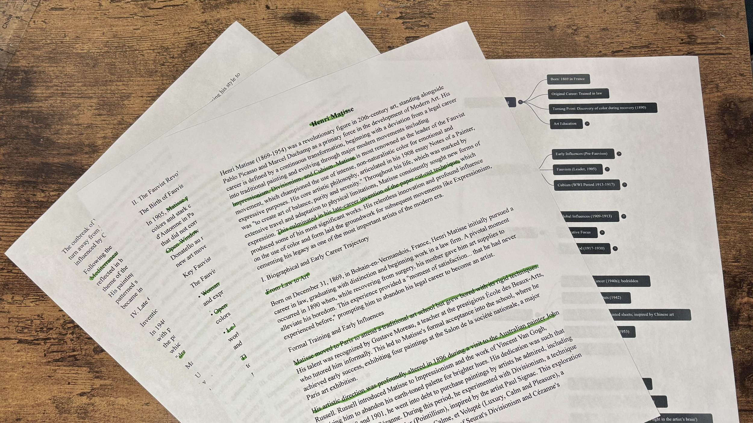
I conducted in-depth research and reviewed literature on Henri Matisse’s body of work, contributions to art, and historical and cultural significance by concept mapping and focusing on how his design principles (e.g., use of form and color) connect to contemporary design.
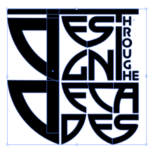
TYPOGRAPHIC LOGO AND DESIGN
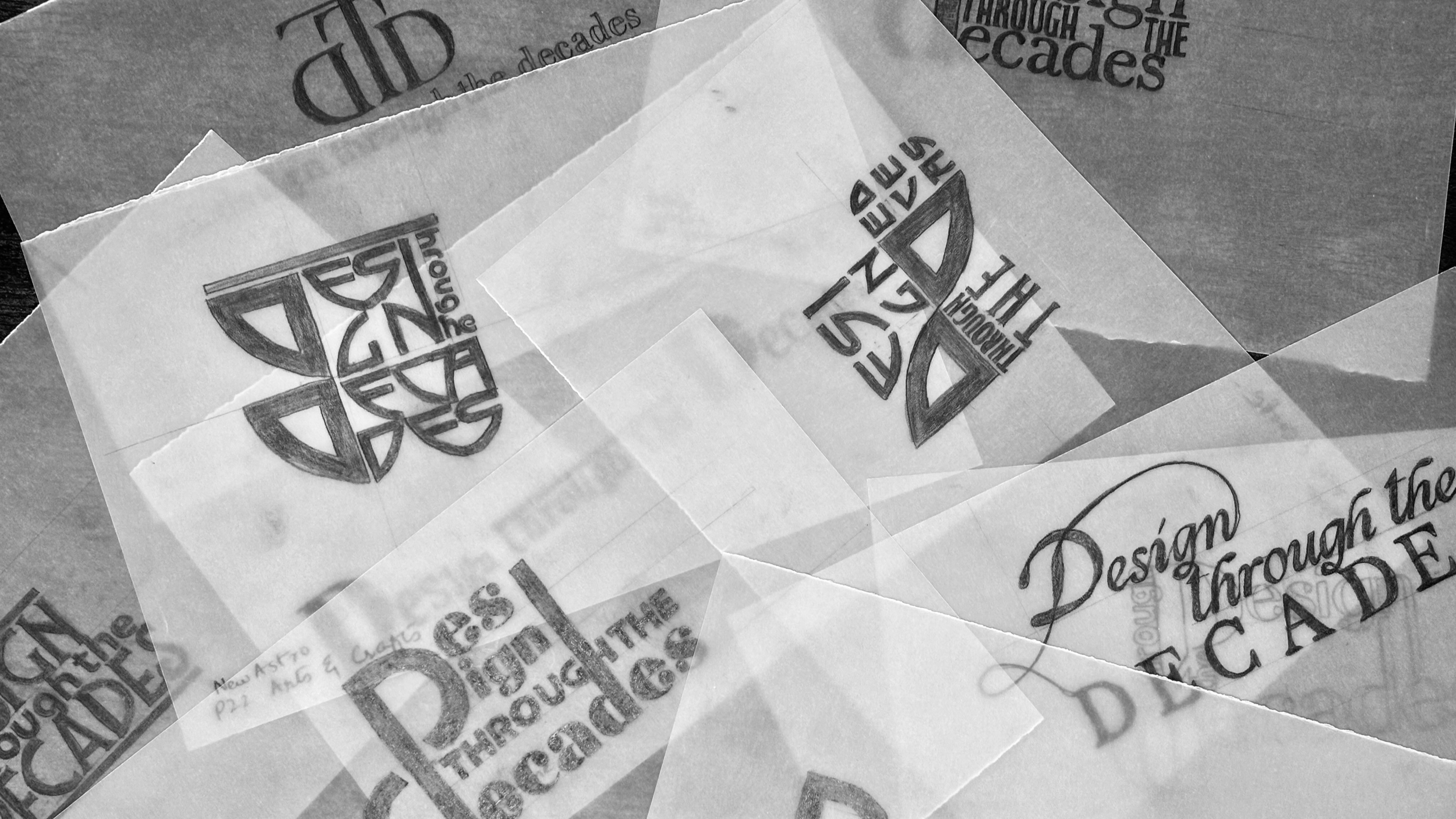
I initiated the visual identity by sketching and iteratively testing 10-12 different typefaces and sizes to create a logo that captured Matisse's unique style while maintaining legibility and creativity. The final logo was digitally executed in Adobe Illustrator.
ARTICLE DRAFT AND REFINEMENT
I wrote a comprehensive article following all APA guidelines for in-text citations and formatting. The initial focus on facts was reframed after testing to prioritize deeper analysis and interpretation of Matisse's impact on design.
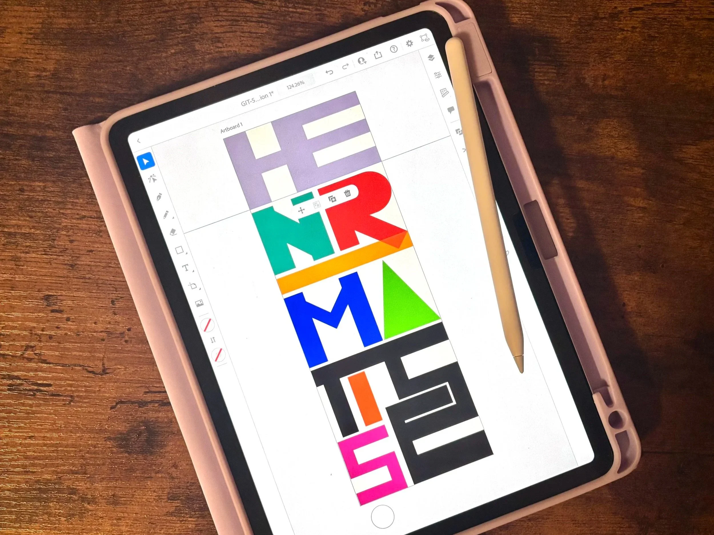
USER FEEDBACK AND ITERATION
The article and design concepts underwent peer review and user feedback. Feedback led to significant structural improvements in the article, including adding strong transitional sentences and summary paragraphs to enhance reading flow and clarity. Furthermore, the final design incorporated user-suggested enhancements, including the implementation of varied grids and layouts to increase the creative display. The overall flow and structure of the magazine were further refined through the strategic use of background colors and shapes.
Research Highlights
Research extended beyond basic description to include deep analysis and interpretation of Matisse's work, understanding his role in art history, and his specific design principles. Key academic journals and art museum websites were studied to inform the appropriate professional tone and required intellectual depth. The research directly informed the color palette, design motifs, and overall thematic consistency of the magazine layout.
Deliverables
SCHOLARLY ARTICLE
A fully authored article on Henri Matisse’s significance and contributions, adhering to APA formatting guidelines with a complete bibliography, structured for intellectual depth and clear reading flow.
TYPOGRAPHIC LOGO
A stylized, cohesive logo that visually matched the artist's unique style, created through iterative sketching and precise digital execution in Adobe Illustrator.
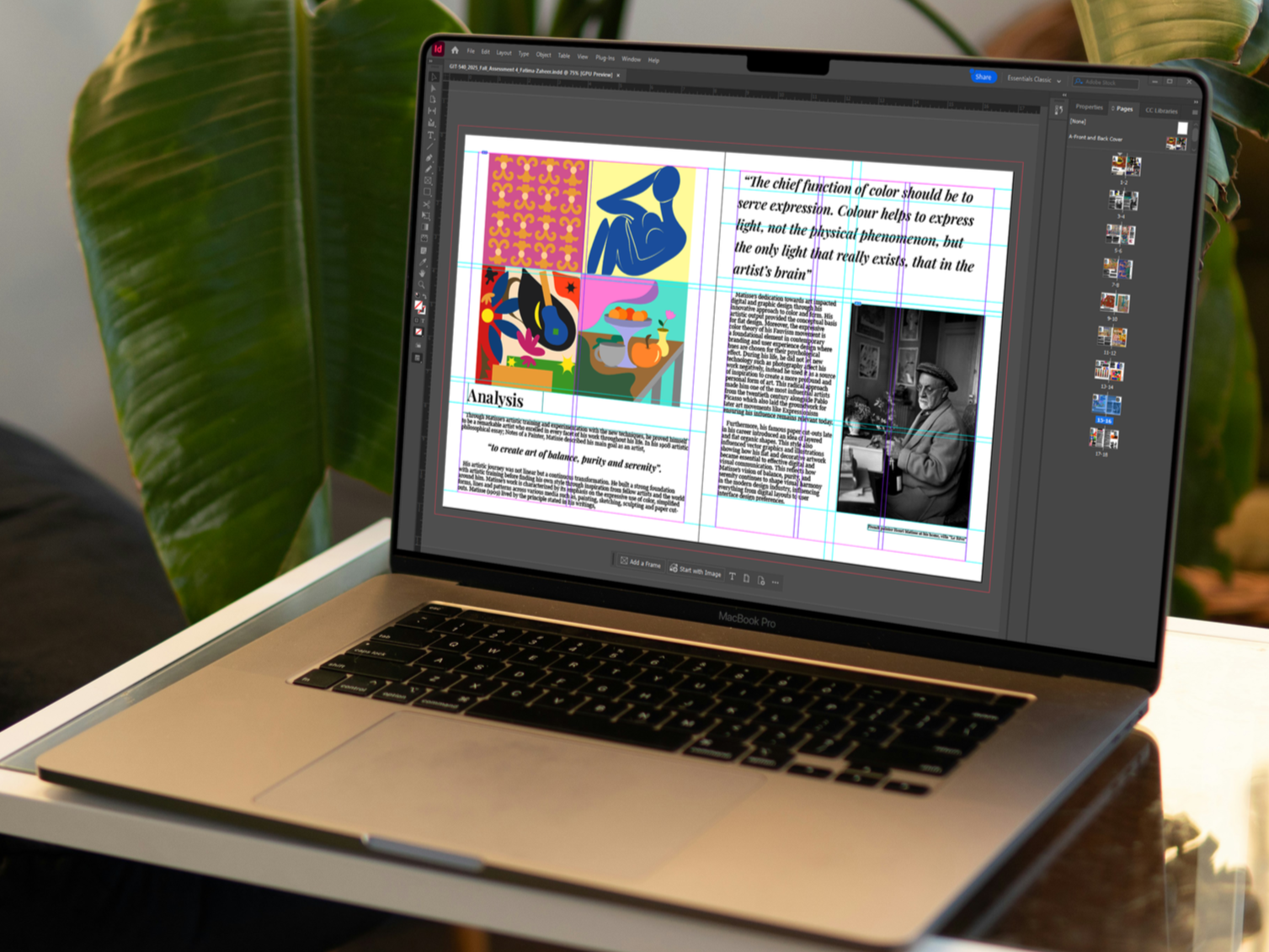
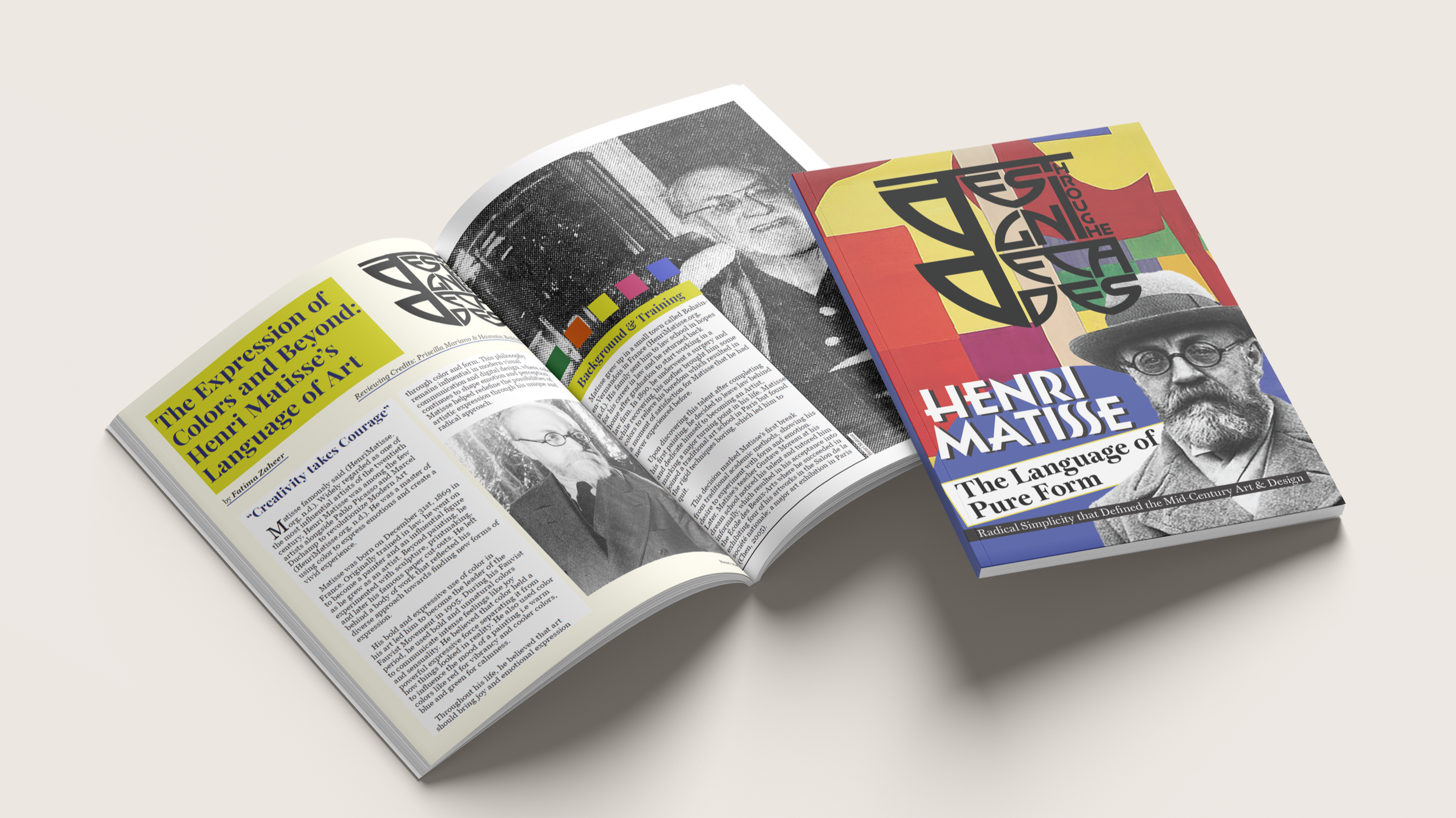
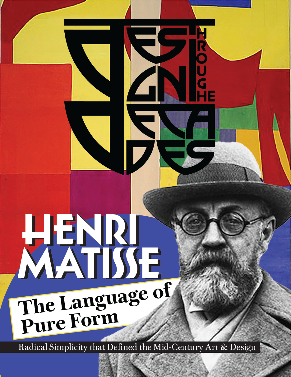
MAGAZINE LAYOUT AND DESIGN
A high-fidelity, professional magazine spread designed in Adobe InDesign, featuring:
Consistent visual hierarchy and thematic elements.
Application of standardized grids and type scales for visual consistency and accessibility.
Incorporation of edited historical artworks and custom motifs (Illustrator).
Results
The outcome was a cohesive, integrated project in which the analytical depth of the scholarly article was perfectly aligned with a design that was both technically precise and visually relevant to design. The project successfully met the audience's high standards by focusing on interpretation and establishing clear connections between historical art principles and contemporary design practices. Moreover, the careful application of fundamental design elements such as a clear visual hierarchy, optimal contrast, and standardized type scales resulted in a magazine that was highly organized, easily understandable, and visually compelling.
Reflection
This project highlighted that successful cross-media design hinges on the precise and empathetic execution of a unified vision, apart from gathering information. The key takeaway was that achieving a good result demands progressing beyond simple fact-finding (the initial understanding of the problem) toward a process of creative analysis and technical accuracy. The iterative process, especially the detailed font testing for the logo and the structural revisions based on peer feedback, was essential for authentically capturing the artist's tone and ensuring the final product met the high professional and academic standards necessary for potential publication.