CASE STUDY
MOOD: Event Ticketing Mobile Application
Transforming the Live Music Experience for the Mood Audience
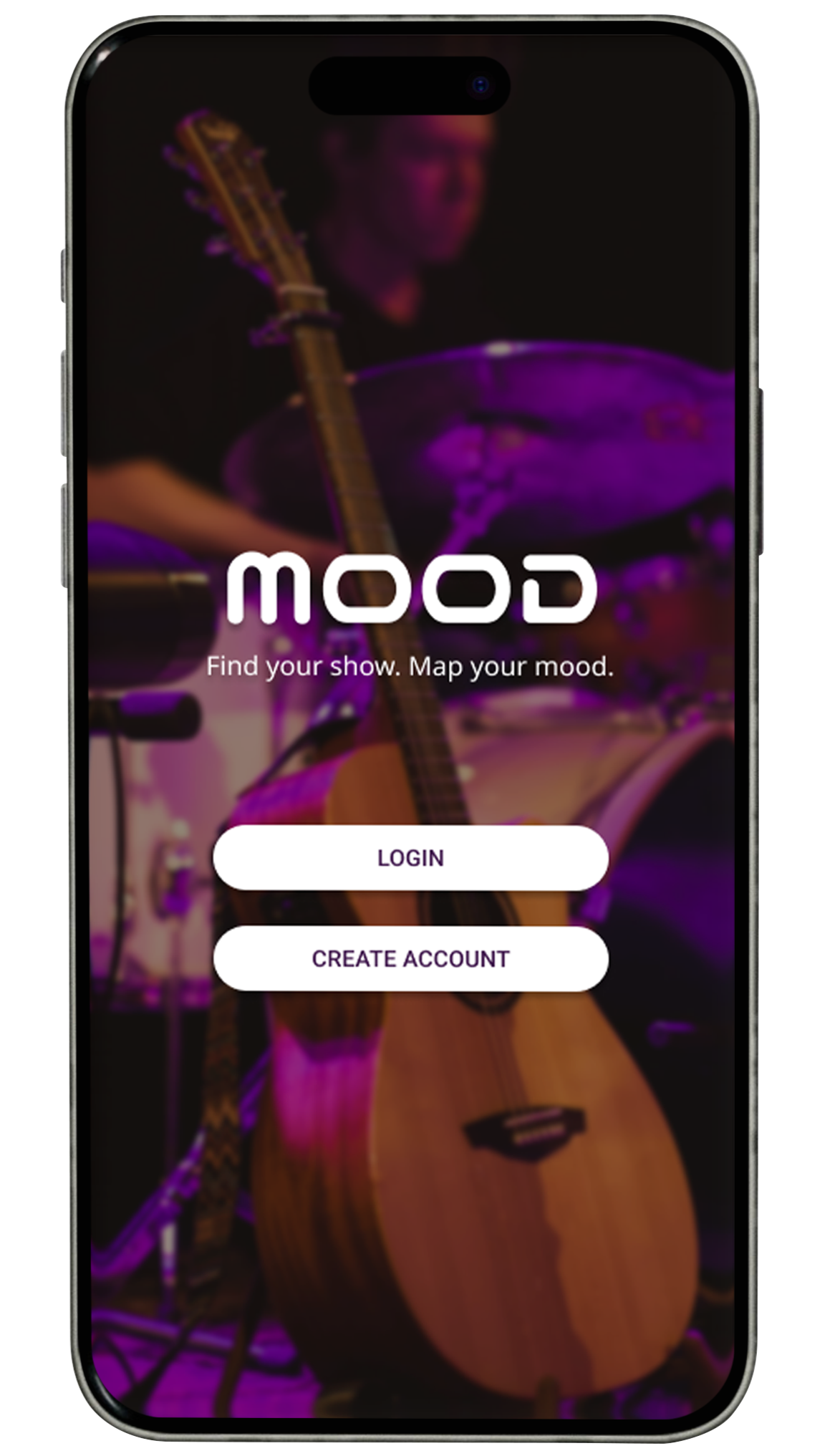
Overview
Project: A high-fidelity mobile ticketing platform for Mood Venue Group (Phoenix, Tempe, Glendale) in Arizona.
Goal: Transition an analog business into a seamless digital experience that eliminates venue confusion and streamlines the high-pressure ticket purchase journey.
Tools: Figma (Prototyping & Design System).
Inspiration: This was one of my final projects in the “Wireframes and Prototyping” course in the UX MS program at ASU. I analyzed the music industry and discovered applications like DICE (for event discovery), StubHub (for reliability), and Eventbrite (for ticketing logistics) to deliver an interface customized for the fast paced local club scene.
Visual Identity and Design
To match the idea of Arizona’s nightlife, I created a design that balances a trendy style with clear and readable information.
BALANCED THEME
I chose a deep purple and high contrast color palette for several user-centric reasons:
The Environment: Concert apps are frequently used in night or evening venues with low light. A balanced dark theme reduces screen glare and prevents the user from being blinded when checking their ticket in dark settings.
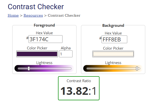
Color Palette: Purple sits at the intersection of energetic and mysterious, which mirrors the underground rock and experimental music scenes at Mood. Designed with a high-contrast color palette that abides by WCAG guidelines to maximize accessibility for a diverse user base.
Visual Hierarchy: I designed the interface with high contrasts, which allows the barcode and call-to-action buttons to stand out visibly, and makes the ticket scanning process fast and error free.
TYPOGRAPHY AND BRANDING
Logo: I used the Nico Moji (royalty-free) typeface for the logo to give it a futuristic and edgy personality that stands out in the Phoenix market.
Body Copy: For the app's interface, I used the Noto Sans typeface. This provides users with a legible experience across all screen sizes, which is crucial for quickly scanning event times or venue addresses.

COLOR PALETTE
The Problem
The Physical Digital Gap: Mood’s success across three cities created a fragmented user experience. Fans often struggled with the Right Band and Wrong City issue. The lack of a digital space meant no way to guarantee an entry to 300 capacity “sell-out” shows at the Glendale location.
A. THE SMART NAVIGATION SYSTEM
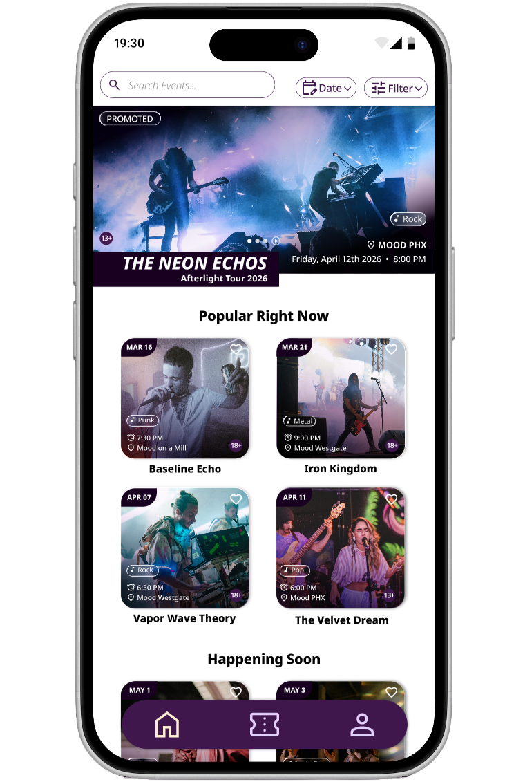
I implemented a dual navigation strategy for the users so they do not feel lost on any screen while browsing events:
Sticky Bottom Navigation: Features three options, Home, Tickets, and Account. This enhances the user experience, ensuring that users are always only one tap away from their entry barcode.
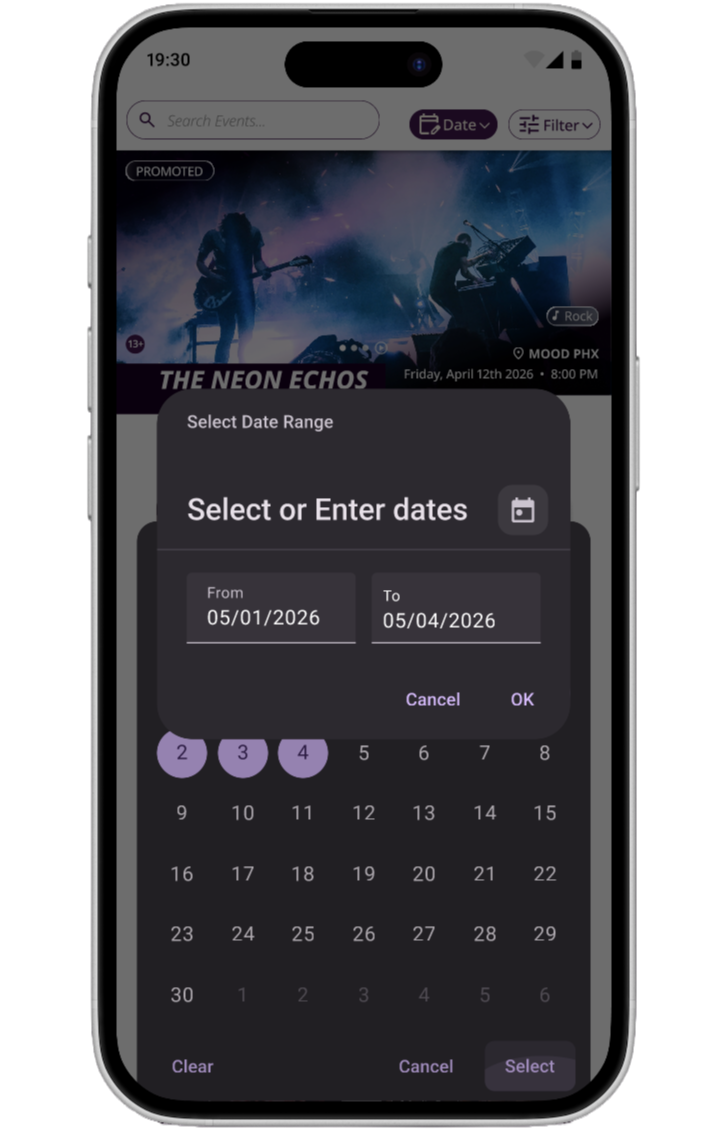
Sticky Header: This stays at the top of the main events page, housing the Search function and the Dynamic Filters (Date, Genre, and Location). This allows users to browse 7 days of events across three Mood locations without struggling.
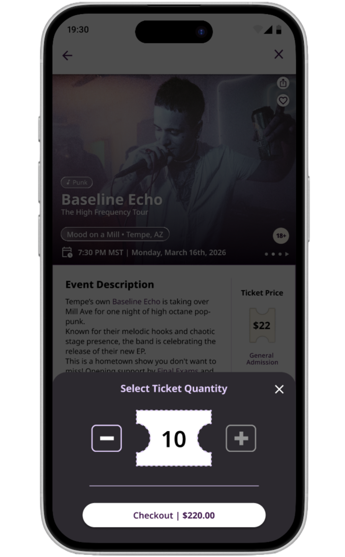
B. THE EXPRESS CHECKOUT
Inspired by the speed and design of the application DICE, I wanted to do something different from the traditional shopping cart experience.
Logic: Users select their quantity (up to 10) and move directly to a secure checkout.
User Impact: This reduces cognitive friction and cart abandonment. It allows fans to secure tickets for high demand shows in under a few steps and minutes.
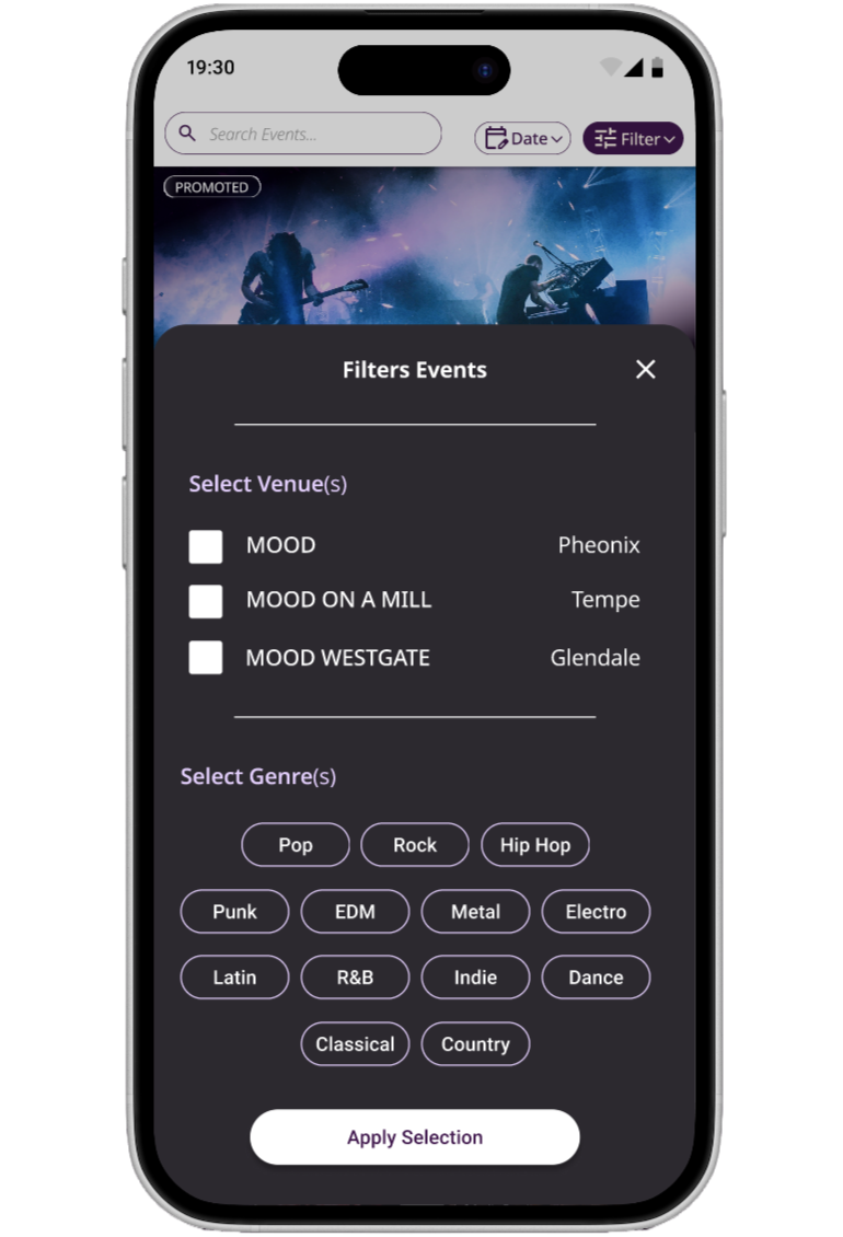
Filters by Genre & Venue
Sticky Navigation & Fixed Header
Express Ticket Purchasing
Features
Filter by Date
MULTI-VENUE FILTER
The app's brain is the filter system. I designed it to handle complex sorting, for example, “Punk shows at Mood (Phoenix) and Mood on Mill (Tempe) on XYZ date.” This lets users curate their own night out based on their specific tastes and location.
SECURE VIRTUAL TICKET
The ticket is the most critical touchpoint.
Per stakeholder requirements, I used a black-on-white linear barcode to ensure compatibility with existing venue scanners.
I explicitly added the city in bold font, e.g., Mood on a Mill (Tempe, AZ), to the ticket to solve the recurring issue of patrons traveling to the wrong venue.
Testing and Stakeholder Pivot
Working within the defined business constraints of the project, I conducted a simulated stakeholder review and then presented the final prototype to the stakeholders.
I iterated on the prototype on Figma to satisfy stakeholder requirements. This included increasing the ticket limit to 10, which was only 4 before, and optimizing the virtual ticket for physical scanning, as outlined in the initial project brief.
The Cart Removal: We confirmed that a “no cart” flow worked better for this specific business model by prioritizing speed over multi-item browsing.
The Group Update: We increased the ticket limit to 10 to accommodate the group outing culture prevalent at the Westgate location.
Outcome and Reflection
By blending a bold visual theme with a rigid and structure thats driven by utility, I created a prototype that feels like a professional grade musical events ticketing application.
WHAT I LEARNED
When you're designing for live music, you have to balance the idea with the utility. The app needs the energy of a VIP pass which drove my choice for the high-contrast theme and Nico Moji font, but it also needs to work under pressure. The design handles the heavy lifting by keeping the interface grounded with legible Noto Sans copy and sticky navigation, letting fans focus on what matters: discovering great music and making memories at the show.
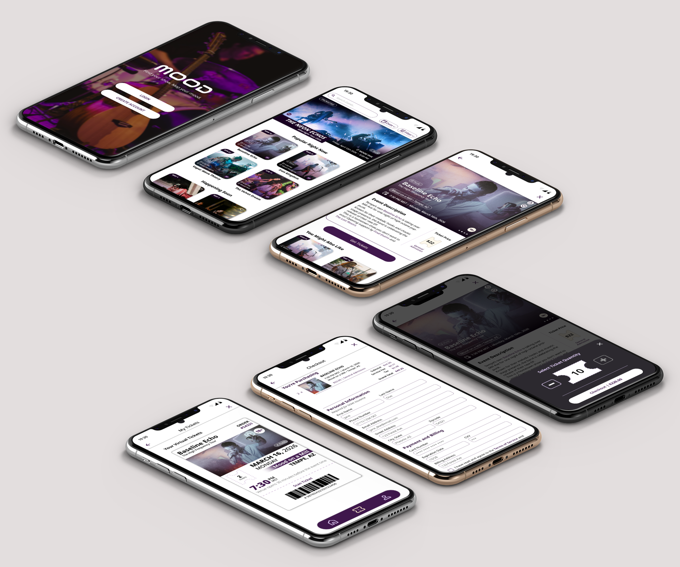
Interactive Flows in the Prototype:
Verified Onboarding: MFA (multi-factor authentication) sign-up with an optional skip option for additional personal information.
The Master Filter: A sticky header interaction for Date, Genre, and Venue.
Direct-to-Ticket Purchase: Maximum 10 tickets can be checked out with integrated credit card entry.
The Door-Ready Barcode: Quick-access ticket retrieval with high-contrast scanning optimization.
Flow 1
Flow 2
Flow 3
Flow 4