MINI CASE STUDIES
Print Media: Poster Design
This collection brings together university coursework focused on print media and visual design. Everything here was built from scratch, inspired by existing web designs, photos or assigned coursework. Famous artworks or existing designs featured in these projects are recreated solely for practice to master the software.
This section features three academic projects focused on technical replication, precise typography, and data layout. Each poster was built from scratch to master complex design software workflows.
1. Infographic Poster
A data-heavy project transforming raw information into a clean, scannable layout using custom vector assets, charts, and structured visual hierarchies.
2. Yale Architecture Poster Recreation
A strict technical replication of the official Yale Architecture poster, built to master complex grid structures, alignment, and minimalist print styling.
3. Typographic Poster: Malala
A text-driven layout focused entirely on typographic hierarchy, tracking, and kerning to form a cohesive visual portrait using only letterforms.
Case Study 1
The Infographic Poster
Overview
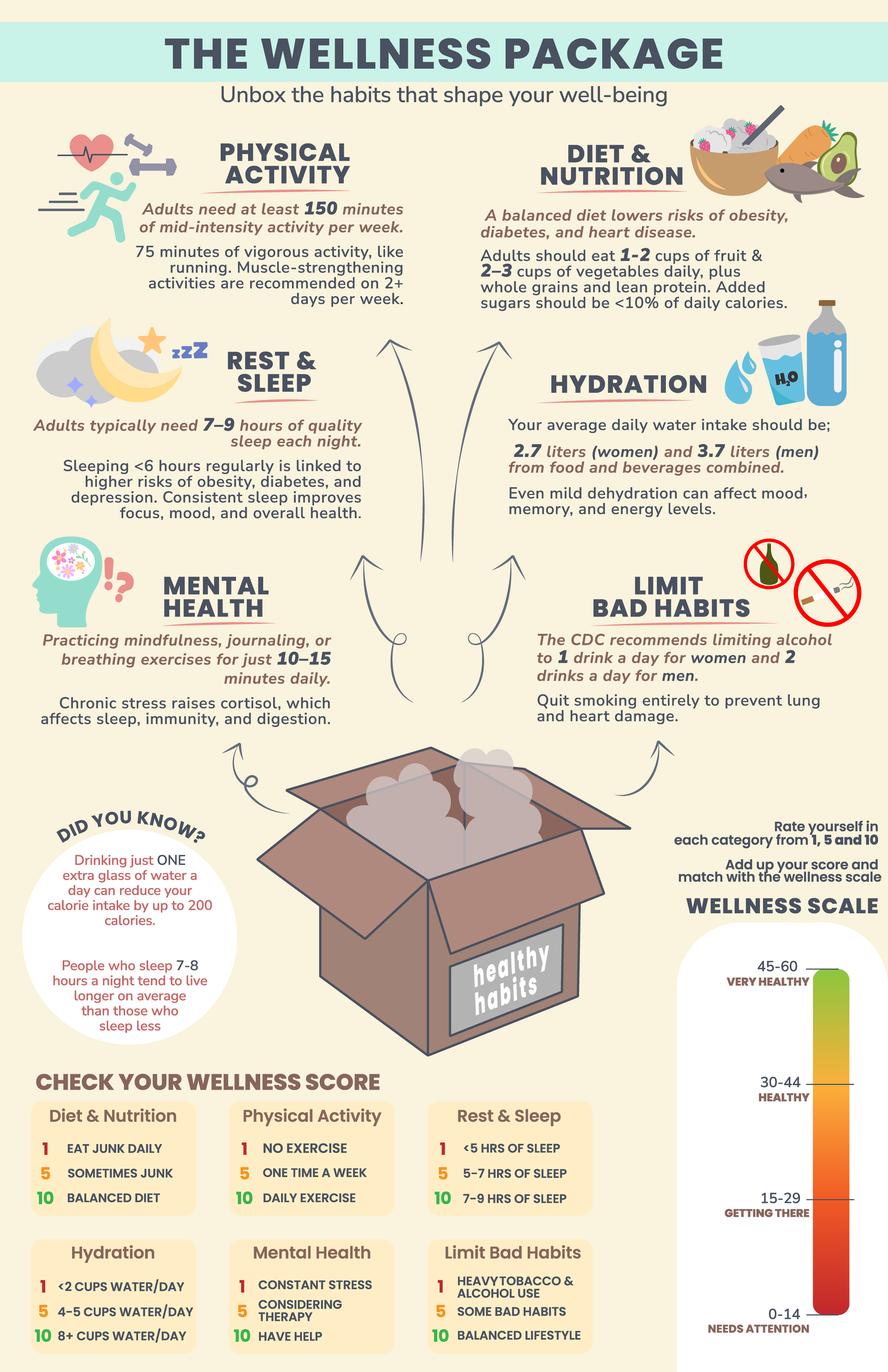
This project was about taking health and wellness advice and turning it into something that’s fun to look at. For my GIT 540 assignment, I decided to create “The Wellness Package”, an infographic designed to look like you’re unboxing a healthier lifestyle.
This project was a personal creation focused on translating health data into a friendly, approachable visual format.
The Original Idea: The concept of "unboxing" wellness was designed to make health goals feel like a gift rather than a chore.
Design Influence: The style was inspired by modern "flat design" trends that use bold icons and soft pastel palettes to make technical data feel less intimidating.
Credits: Content: Health guidelines sourced from the Centers for Disease Control and Prevention (CDC).
Design & Illustration: Original work by Fatima Zaheer for GIT 540 course.
The Idea and Sketching
I started by thinking about the six main things that keep us healthy: exercise, food, sleep, water, mental health, and cutting back on bad habits. Before even touching a computer, I drew 10 different layout sketches. I played around with a few ideas, some were very boxy and structured, while others were more circular.
I eventually landed on the box concept because it felt welcoming. I liked the idea of these healthy habits floating out of a package, making it feel like a gift rather than a chore.
Designing in Adobe Illustrator
Once I moved into Adobe Illustrator, I set up my canvas to 11x17 inches. Since the assignment required everything to be a vector (no photos allowed!), I built every icon from scratch.
The Icons: I used simple shapes to create things like the sleeping moon, the water bottle, and the little brain. I wanted them to look clean and modern.
The Colors: I chose a soft, warm background so the bright colors of the icons would pop. It makes the whole thing feel friendly and less like a boring medical chart.
The Scale: At the bottom, I added a "Wellness Score" section. I used the Gradient Tool to make a color bar that goes from red to green, which gives people a quick way to see how they're doing.
Artist Statement: The Wellness Package
For this project, I wanted to take the world of health advice and make it approachable and achievable. We’re constantly told what to eat, how much to sleep, and how much water to drink, which can often feel like a heavy load to carry. My goal was to flip that perspective by using the metaphor of a package and treating wellness like a gift you’re unboxing for yourself while make it fun.
I chose a soft, inviting color palette and clean vector illustrations to keep the mood light and encouraging. By balancing data (like CDC guidelines) with a fun, interactive Wellness Score at the bottom, I aimed to create a piece that isn't just informative, but also engaging. This project allowed me to practice my technical skills in Adobe Illustrator while focusing on how good design can make complex information feel much more human.
Case Study 2
Yale Architecture Poster Remake Challenge
Original Design: This poster was created for the Yale School of Architecture Fall '13 events.
The Team: The design was produced by the legendary firm Pentagram, led by partner Michael Bierut and designer Jessica Svendsen.
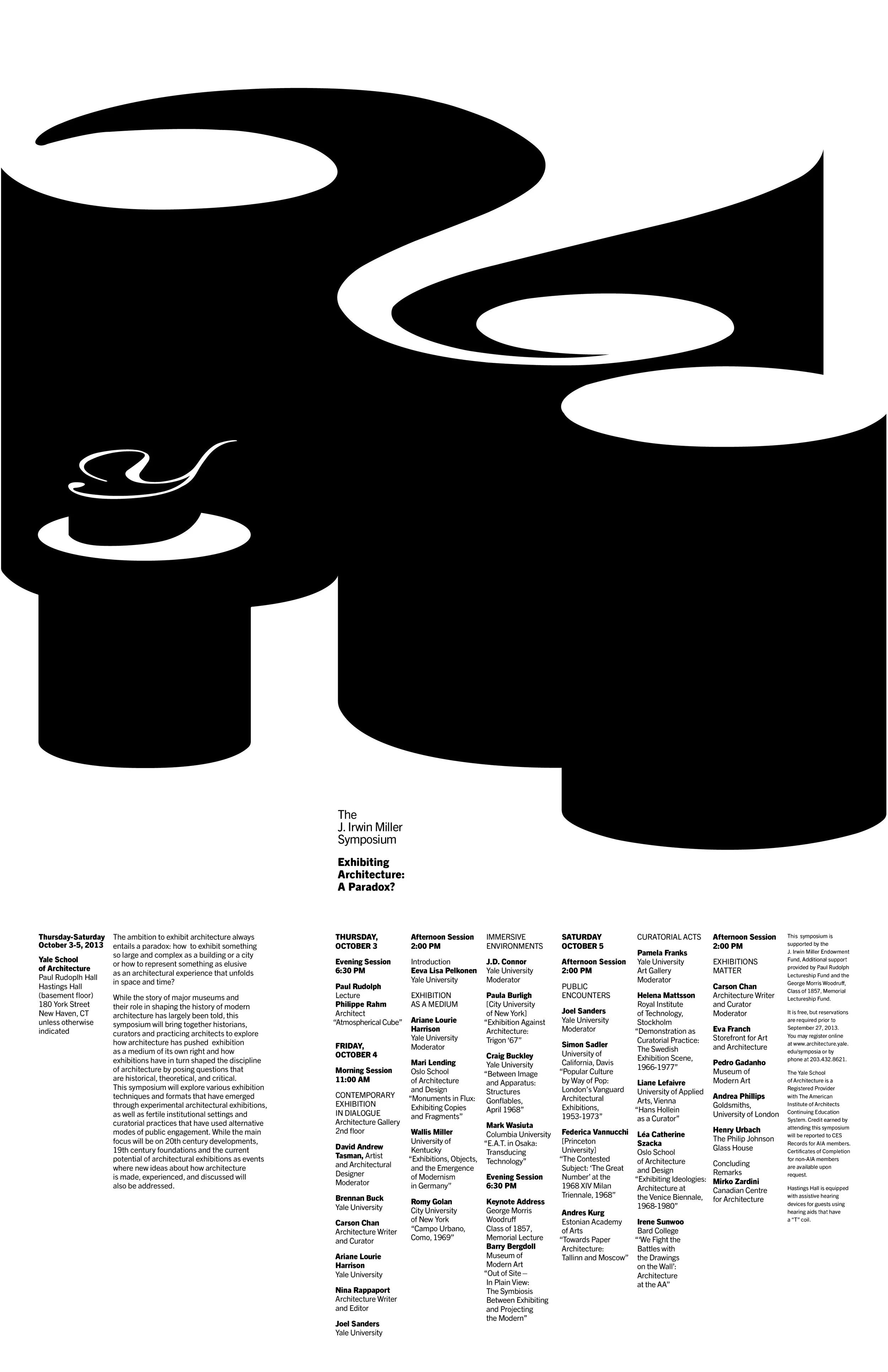
Concept: The poster promotes the J. Irwin Miller Symposium, titled “Exhibiting Architecture: A Paradox?”.
Overview
Course: GIT 540 | Tools: Adobe InDesign & Adobe Illustrator | Format: 11" x 17"
Design Philosophy: Since 1998, Bierut’s series for Yale has followed a strict master rule: use a standard size, work only in black and white, and use only typography with no photos. The swirling black shapes represent abstract architectural forms, turning text into a physical structure.
Reconstruction Process
The goal was to reverse-engineer this masterpiece to build mastery in spacing, rhythm, and composition.
Vector Art (Illustrator): I hand-drew the iconic swirling shapes using the Pen Tool. I had to be precise to match the architectural curves of the original artwork.
Layout & Typography (InDesign): I moved the vector graphics into InDesign to build the text-heavy layout using grids.
The Font Match: Since the original font wasn't available, I used Trade Gothic Next LT Pro (Regular and Heavy). It was the perfect substitute because it captures that same clean, professional Yale aesthetic.
Manual Detail: I retyped every single word of the symposium schedule. I focused on matching the leading (space between lines) and margins to the original grid.
Reflection
This project taught me that great design is often found in the boring details, the exact millimeters between lines of text and the way shapes overlap. By studying Michael Bierut and Jessica Svendsen’s work so closely, I learned how to organize a massive amount of information without losing the artistic, bold look of the poster. It was a lesson in discipline and technical accuracy.
Case Study 3
Typographic Poster of Malala Yousufzai
Overview
This project for GIT 540 was a blend of graphic design and storytelling. The goal was to create a Typographic Portrait, an image made entirely out of words. I chose to feature Malala Yousafzai, the Pakistani activist and Nobel Peace Prize winner. As a girl myself, her bravery in fighting for girls' education is incredibly inspiring to me, and I wanted to honor her story through this technical challenge.
Excerpts from Malala’s 2014 Nobel Peace Prize Acceptance Speech.
The Vision: Malala’s Nobel Peace Prize Speech
I used the real text from Malala’s famous Nobel Peace Prize speech. I wanted the portrait to literally be made of her own voice which was also this project’s requirement. By using her words to form her face, the design represents how her message of education and struggle is inseparable from who she is.
My Creative Process
Working on an 11" x 17" black background, I had to rethink how I draw. Instead of using a pen or brush, I used letters to create light and shadow:
Foundation: I started by outlining Malala’s recognizable features, like her headscarf and eyes by using the Pen Tool. This gave me a map of where the text needed to go.
Value with Type: To make her face look 3D, I played with font weights. For the shadows under her chin or the folds of her scarf, I used bold, dense text packed closely together. For the highlights on her forehead or cheeks, I used thin, light font with more space between the letters.
Warping and Shaping: I used Illustrator’s Envelope Distort and Type on a Path tools to make the sentences curve around her face. This helped show the contours of her features, making the portrait feel more realistic.
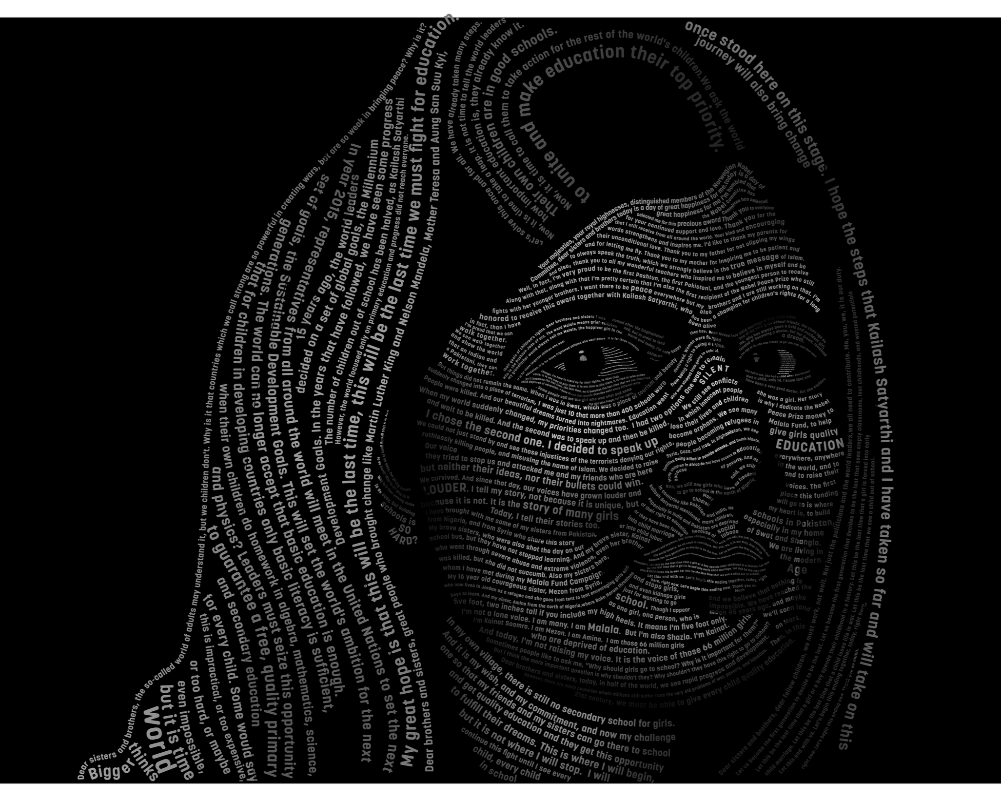
Typographic Portrait of Mala Yousafzai
Technical Execution
Legibility vs. Form: The hardest part was making sure she was recognizable while keeping the text readable. I had to carefully choose which parts of the speech were most visible, highlighting powerful words like Education and Peace.
Organization: Because this project involved hundreds of individual text boxes, I kept my Layers Panel organized. I separated the Background Text, Features, and Scarf into their own folders so I could edit them without getting overwhelmed.
Vector Precision: I avoided rasterizing (turning things into pixels) so the portrait could be scaled to any size, even as big as a billboard without losing its crispness.
Reflection
This project went beyond a standard class assignment, serving as a focused exercise in combining digital art skills with advanced typography. The project required two days of intensive work to complete, demanding extreme precision to ensure Malala’s face correctly emerged from the text layout. The final piece demonstrates that typographic design is not just about what the words say, but how their visual arrangement and meticulous placement can tell a compelling story.